5 Fall Layout Ideas for November
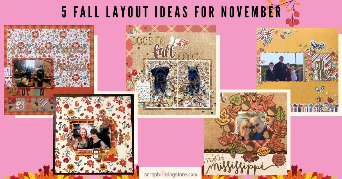
With autumn in full swing, we’re excited to present these beautiful layout ideas that we hope will inspire you to create your own! The Design Team loved our spicetacular November Kit and had a blast using it to capture their cherished memories. Enjoy!
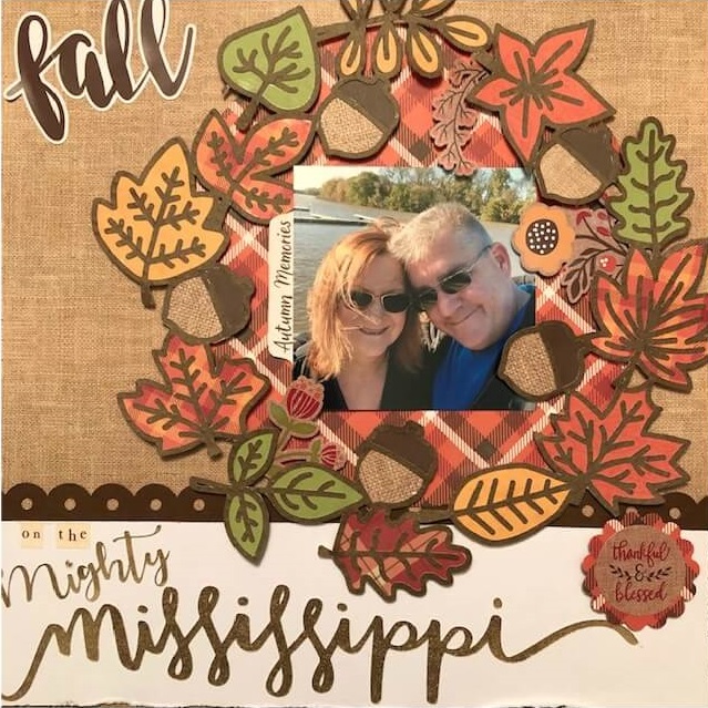
1. Fall on the Mighty Mississipi by Melissa Bierlein
Fall has always been Melissa's favorite time of the year. She grew up near the Mississipi river and every time she returns home, they always visit it. How can they not when it's so beautiful and majestic?
Title of the page: Melissa used the "FALL" sticker from the base kit and placed it in the upper left corner. The bottom of the layout continues the title with small stickers that read "on the Mighty Mississippi". She had it done on her Cricut machine using gold paper from Hobby Lobby. She then adhered the rest of the title to a piece of light Bazzill cardstock (from her stash) and attached it the bottom of the layout.
The light cardstock was distressed and inked along the edges. Melissa attached a Bazzill border strip at the top. Then, she cut out a flower shape and adhered the sticker ‘thankful & blessed’ from the November Kit sticker sheet.
Wreath: The wreath is a Paige Taylor Evans cut file that was done on the Cricut with brown dotted paper. Melissa used the cut file with various patterned papers and journal squares from the kit. She also used some green scrap paper (from her stash) to back three leaves. Then, she cut out a piece of patterned paper in a circle to place behind the wreath. Using foam dots, she popped up the wreath and tucked the stickers from the sticker sheet around it.
Photo: There is hidden journaling behind it (on the Autumn Memories card that is tucked right under)
Check out more of Melissa's gorgeous layouts and crafts on her Facebook page!
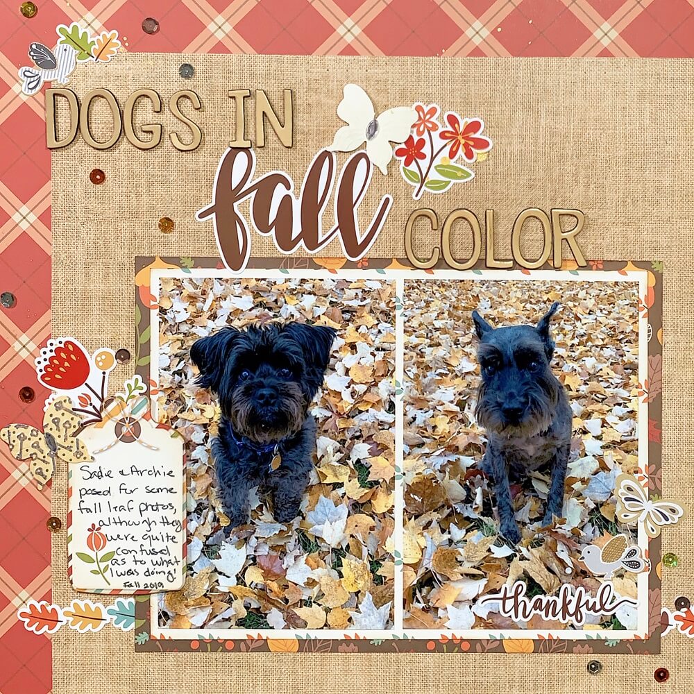
2. Dogs in fall color by Rachel Raynolds
When Rachel saw all the colorful leaves in her yard, she couldn't help but enlist her dogs in a fall leaf photo shoot!
She started the layout using two pieces of beautifully-patterned paper from the main kit. To combine them, she trimmed a two-inch L shape in one and layered it under a piece she had trimmed to be 11"x11", creating a two-sided border on the upper and left-hand sides.
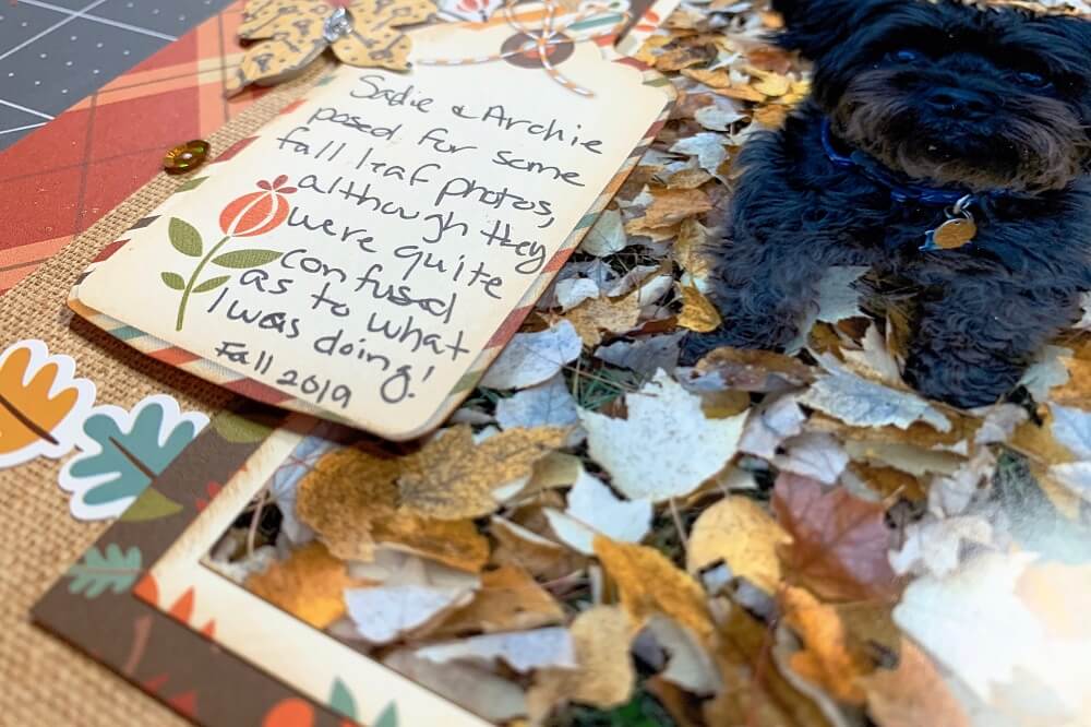
Then, she double-matted her photos together and placed them in the lower right-hand corner to balance the bold border at the top. Next, Rachel trimmed out pieces of a border sticker from the kit and fussy cut out the tag shape from one of the 3x4 cut apart (inking the edges to soften the mistakes made). She's using it as both a place for journaling and part of an embellishment cluster. (How creative!)
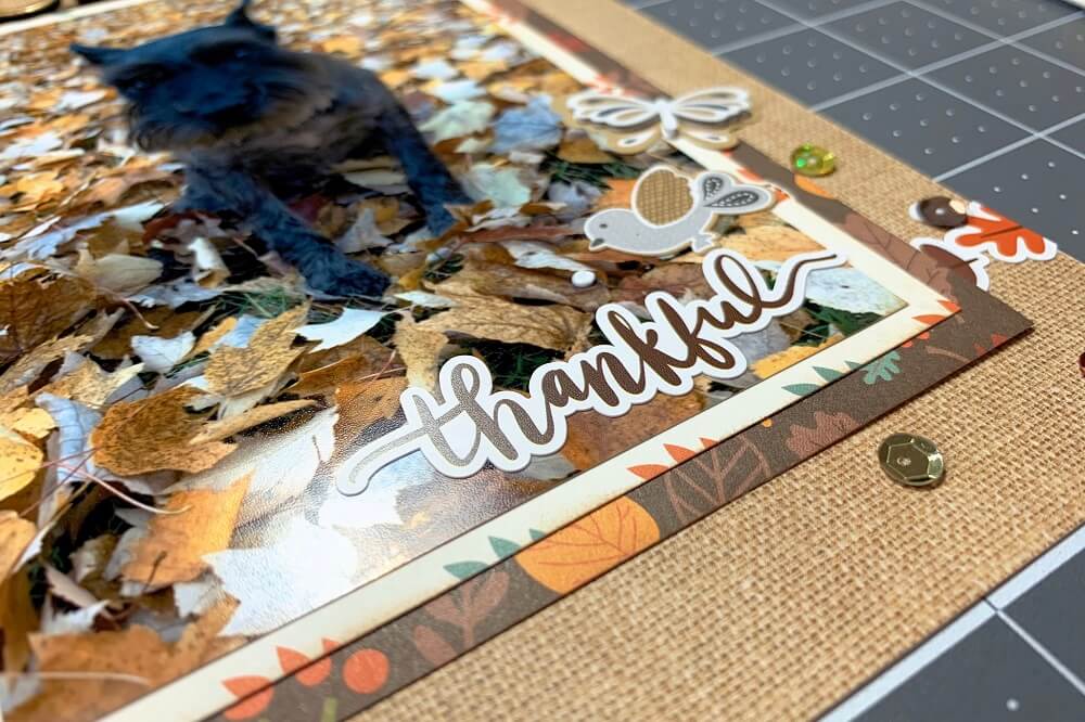
Once the base layer was complete Rachel started embellishing using the collection element stickers from the upgrades, as well as the layered stickers and embossed butterflies.
Her title is a mix of Thickers from her stash and from the element stickers in the main kit. She finished off her layout by misting on some Heidi Swapp gold color shine and adding on some sequins.
Watch below and follow along on how to make this layout. Check out more of Rachel's awesome layout ideas on Youtube!
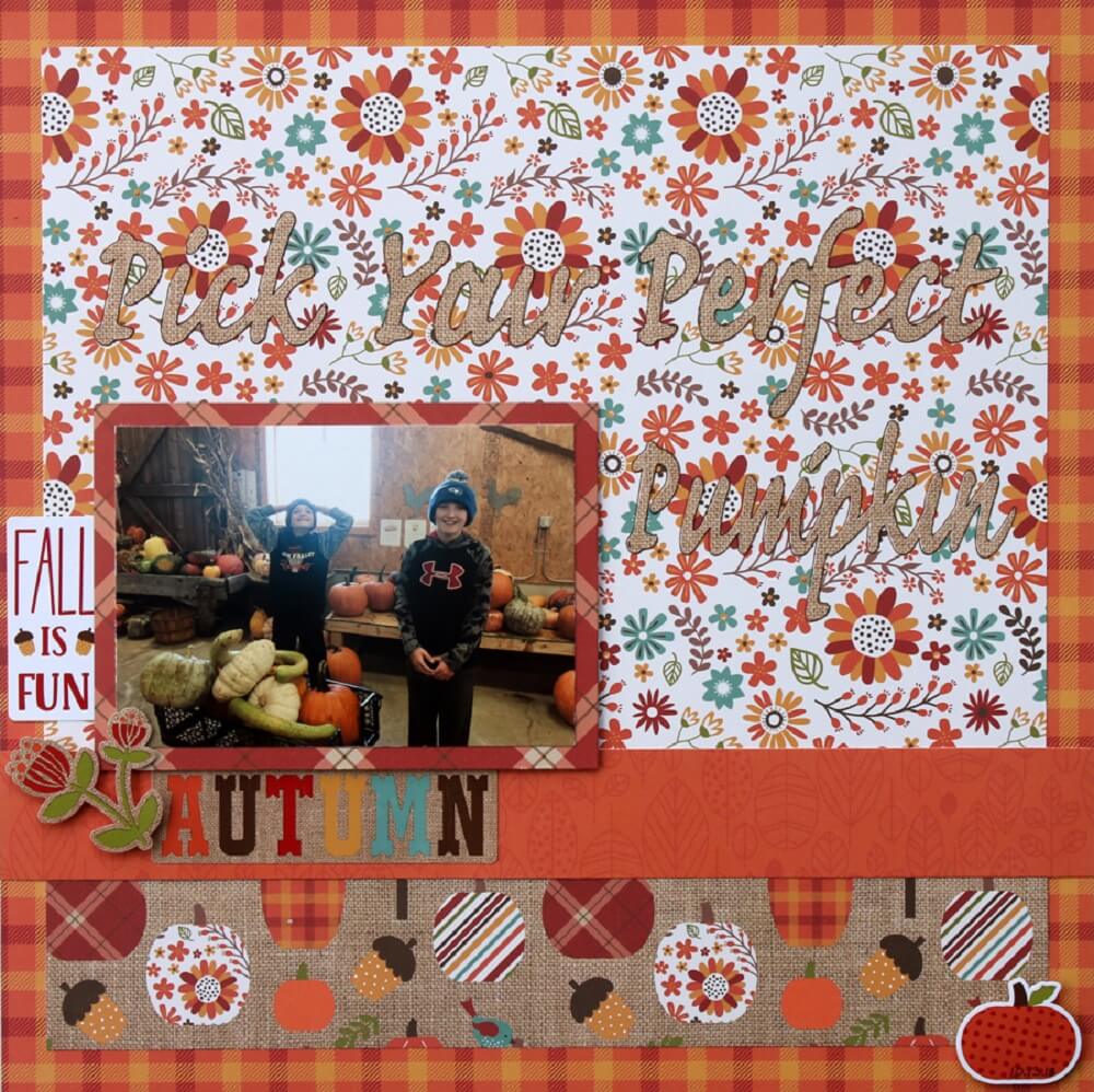
3. Pick Your Perfect Pumpkin by Samantha Taylor
While usually Sam turns to the wonderful embellishments that came with the monthly kit, this time she thought she’d challenge herself and have fun with a layout that uses just the elements from the base kit.
She started by mixing some of the darker prints with brighter, white based prints. Sam likes to made sure she mixed busier prints with more subdued ones, to keep the mix of patterned papers from clashing.
She embellished around the photo using stickers that came on the coordinating sticker sheet. Clustering embellishments around the photo helps draw attention to it. Lastly, she added a title that she cut with her Silhouette. To make the title pop more, she outlined it with a fine tipped brown pen. (great idea!)
Find more fantastic scrapbooking layout ideas on Sam's blog now!
4. Cousins by Sara Mishler
In this layout, Sara wanted to focus on the beautiful fun florals in the November kit. The photo is of her son and his cousins, no real story behind it. She just loves it and the colors couldn’t be more perfect for scrapping it!
Sara started by fussy cutting the florals and adding some dimensional details with Nuvo drops (Stickles or Liquid Pearls would also work for this). The rest of the layout came together so quickly thanks to the elements in the kit.
This month’s kit features such gorgeous colors and is perfect for both autumn photos and for those photos that may feature more jewel tones. Sara pulled in an alphabet from her stash as well as some Nuvo Crystal drops to add some dimension and smaller details to her beautiful layout.
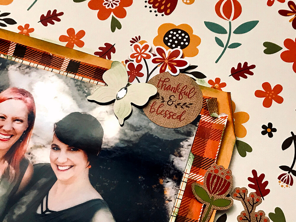
Check out more of Sara's amazing scrapbooking tutorials and get inspired with more layout ideas on her Youtube channel!5. Thankful and Blessed by Meggy Blethen
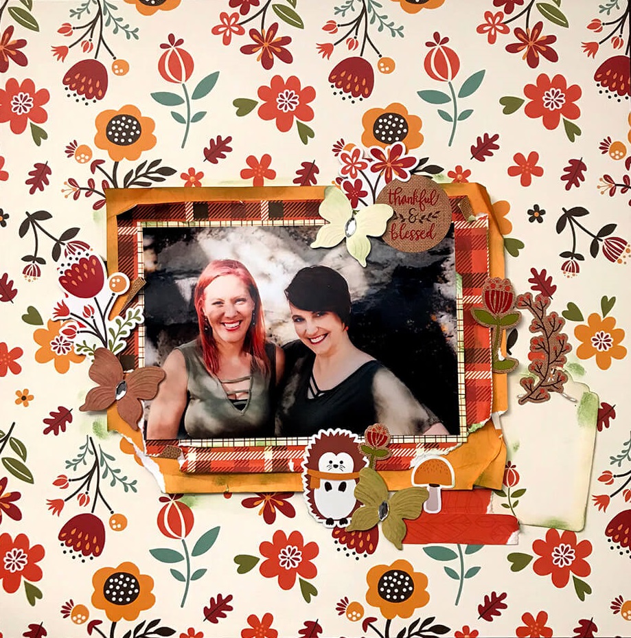
Meggy had so much fun creating her very first layout for us! She's a big fan of the November kit because Fall is one of her favorite subjects to scrapbook (and especially since this month's kit has the perfect elements for every layout idea for the season)! Whenever she uses a kit, the first thing she does is pick a photo that she knows will work well with it.
When she and her scrappy bestie were able to meet for the first time this year, they decided to took some great photos to capture the moment! She was so happy she did, as the photo turned out to be perfect for a fall layout.
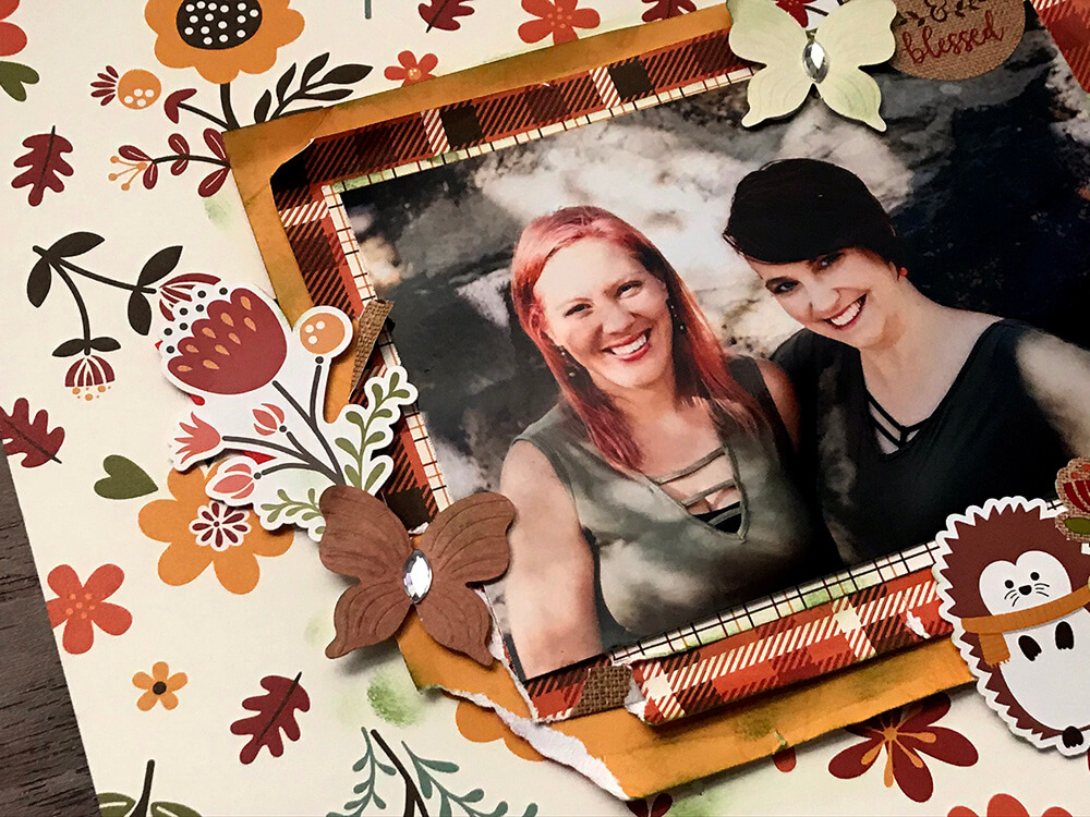
After picking the photo, she went through the papers looking for the perfect background. This time, she decided on a pretty (but busy) floral pattern. Meggy normally tries to stay away from busy backgrounds, but she felt this photo went well with this particular pattern. In order to tone it down a little, she added a few layers behind the photo and then distressed the edges to create some texture.
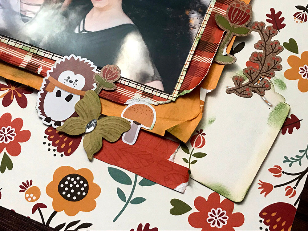
Next, she cut out a tag from one of the 12"x12" cut apart papers to use for journaling. One of the things that she finds hard with busy backgrounds is using creative ways to write about the photo. Most of the time she likes to write directly on her layouts but for this one, the tag worked out so much better.
Meggy added 3 clusters around the photo. In each one, she used a floral sticker and a cute little butterfly from the Jolee's Boutique included in the November upgrade kit.
She has always thought of herself as a non-themed scrapbooker, but the more she crafts and challenges herself, the more she realized how she loves it! So she's very passionate when it comes to using themed and seasonal kits, like this one. The variety of the patterned papers works great. Adding in the mix of hand-picked embellishments kind of threw her off at first, but this was one good challenge!
Get to see more of Meggy's fantastic layouts ideas on her blog and watch her amazing tutorials on Youtube!
You won't beleaf how much we are FALLing in LOVE with the layouts our Design Team members created with the Celebrate Autumn Kit and hope you are too! Visit our blog for more awesome layout ideas now!
Don’t forget to visit our online store! We’re adding new items all the time and Club Members get 10% off and free shipping.
Join our exclusive Facebook Community for Club Members! It will grant you access to amazing layouts and content made by our design team, fun monthly contests, FREE Facebook Live tutorials (Nov 20th) and you’ll get to meet other crafters!
Haven’t subscribed yet? Now’s your chance, be sure to sign up today!
