6 Family Scrapbooking Layouts
It is time to get this par-TEA started! Our Design team made these pre-TEA family scrapbooking layouts from our May 2021 kit. ScrapbookingStore's exclusive collection the Garden Party.
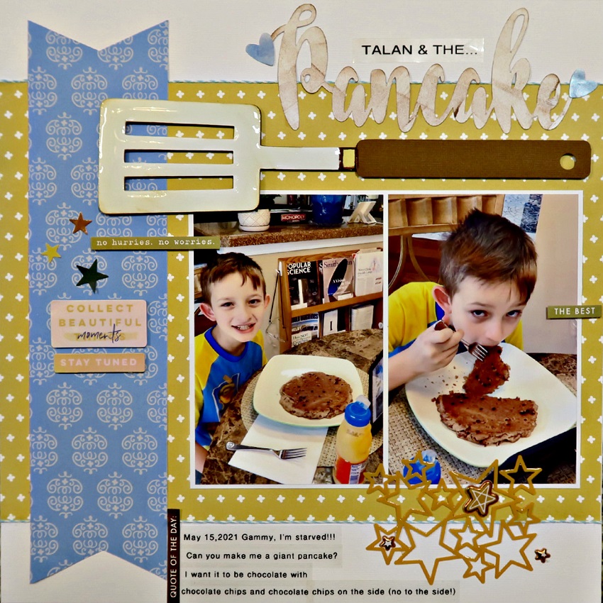
1. Pancake by Marci Bensing
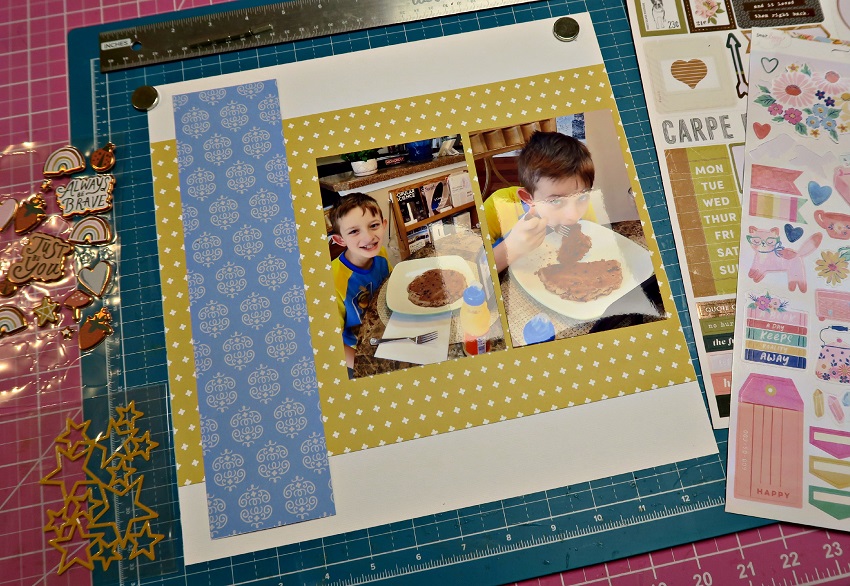
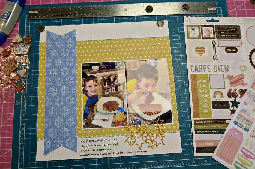
Marci first laid out all of her kit supplies and chose a few "basics" to create a background layer. She decided to put a banner "v" at the top and bottom of her blue strip. Next, she matted her two photos thinly with white cardstock.
Embellishment begins! Marci typed strips of journaling and then adhered the stars next to the journaling overlapping her photo. She added some chunky stars inside and next to the star cluster.
Marci cut the word "Pancake" on the Silhouette Cameo and added two hearts. She also added a word strip "Talan and the..." on top of the title. Next, she added the spatula and popped it up using pop dots. She added stars and words from the collection on the blue strip to complete this beautiful layout!
Don't forget to check out more of Marci's family scrapbooking layouts in her blog now.
2. Just Be You by Megan Blethen
Megan shared with us this super easy instruction on how to make the 6x8 layout she made for her iNSD challenge earlier this month.
She picked her background paper and cut it to 6x8. Then, she cut her first photo to 3x4 and the second photo to 2.5x4. Meggy matted photo one with a patterned paper at 3.25x4.5 and a matted photo 2 with a different patterned paper at 3.75x5.5. Next, she tore the right side of the paper.
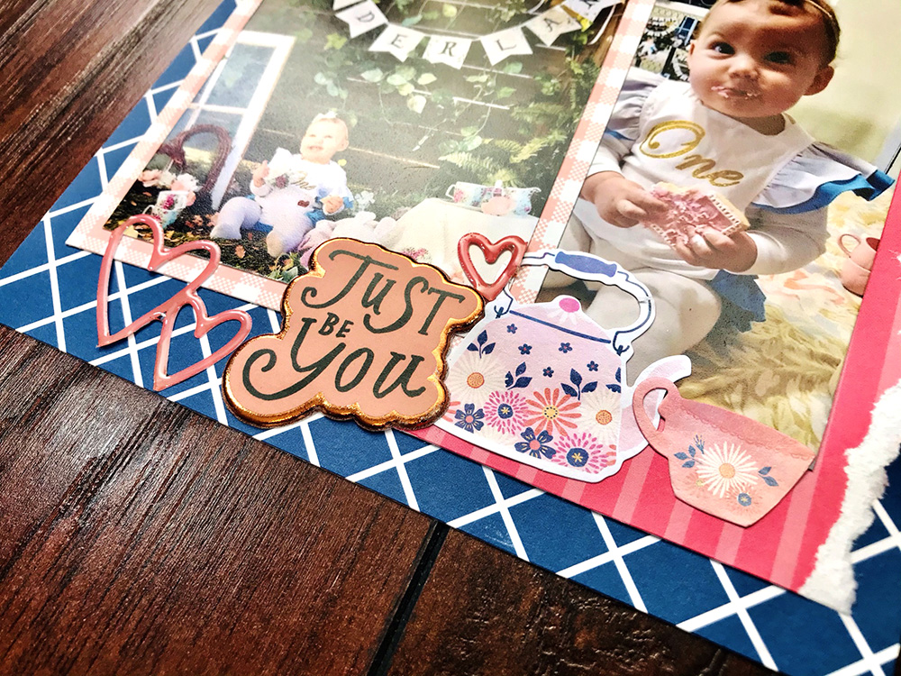
Also, she tore another accent patterned paper at 5.5x1 and placed it in the top left corner. She added sticker embellishments to the top left corner on top of the patterned paper.
Megan glued down photo 2 at the bottom of the page and photo 1 overlapping it to the left of the page. She added embellishments and a title to the bottom of the page. Finally, she added a few small embellishments to the top middle of the photos. Make sure to watch Meggy on her Youtube channel and get to watch more awesome family scrapbooking layouts.
3. Life is Good: Let's Play by Melissa Bierlein
These papers are great for layering! And how cool that they are ScrapbookingStore's brand. The upgrades worked perfectly with the papers. Thanks for such a great kit!
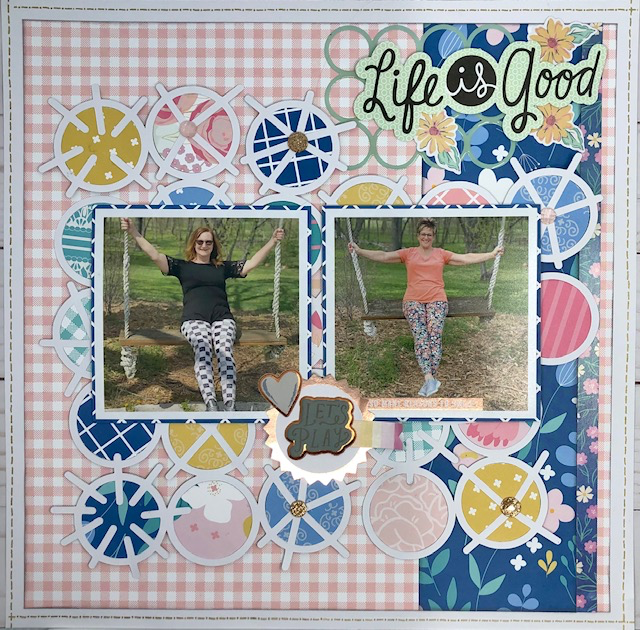
Melissa started her layout this time by choosing the title of her page. The title is ‘Life is Good’.
While at a scrapbooking getaway, Melissa and her friend were walking the property of their Airbnb and found this adorable swing and had a little photoshoot!
For the base page, she used the pink checkered paper from the kit. The edges were inked in gray - ink by Stampin’ UP! She cuts the pink checkered down a bit to layer on some basic white cardstock from her stash. Then, she used some rub-on stitch lines on the edges of the white cardstock. Next, she added a 3” strip of the blue-flowered paper to the right of the layout to add some color.
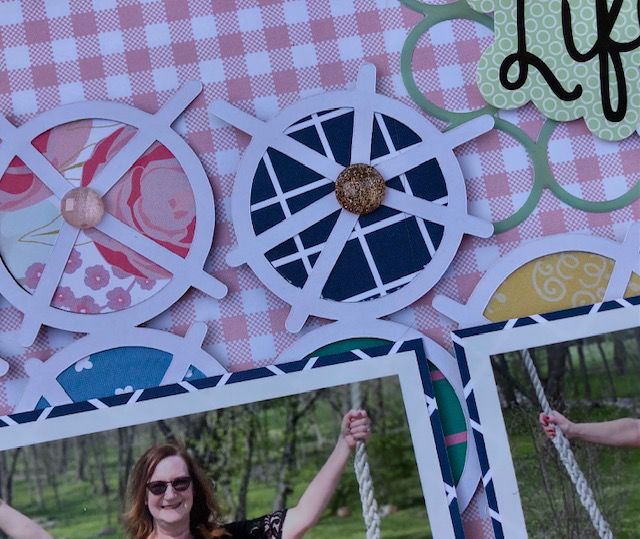
Cut file: Melissa used the Bo Ho Circles cut file from Cut 2 You by Gwen. She cut it on Cricut with white cardstock. TIP: If you have some patterned paper pads on hand that are white on the back use those for cut files and backing photos etc. Melissa goes through her pads and picks out papers that she doesn't LOVE and uses the white backs!
She backed the cut file with papers from the kit and used a circle punch to do this. Then, she adhered it to the base page with foam tape. The photos were also backed with paper from the kit and adhered to the cut file with foam tape.
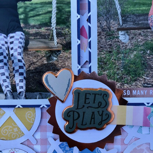
Title area: She used the circle upgrades from Heidi Swap behind the Life is Good sticker. This sticker is from Me and My Big Ideas that are from her stash. Also, she used some flowers behind the life that is good from one of the upgrade sheets. As for the embellishments, she added a cluster from the upgrades at the bottom of the photos. Finally, she added some glitter dots in the center of some of the circles from her stash.
Don't forget to check Melissa's blog to see more family scrapbooking layouts.
4. I Adore You by Samantha Taylor
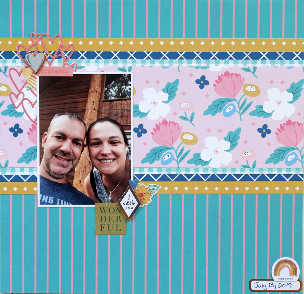
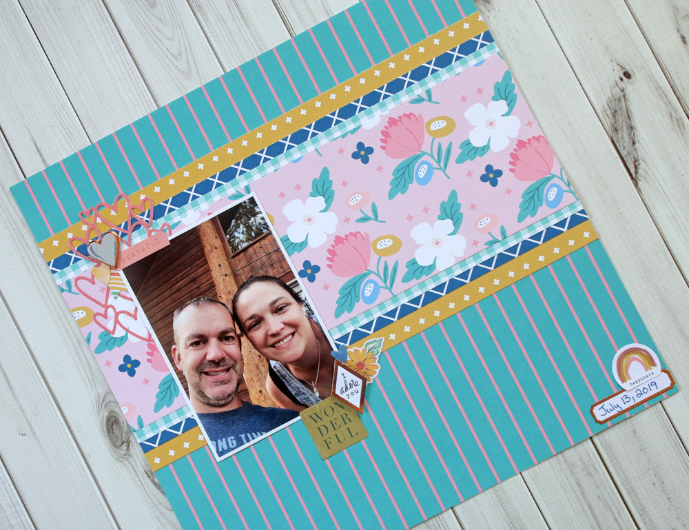
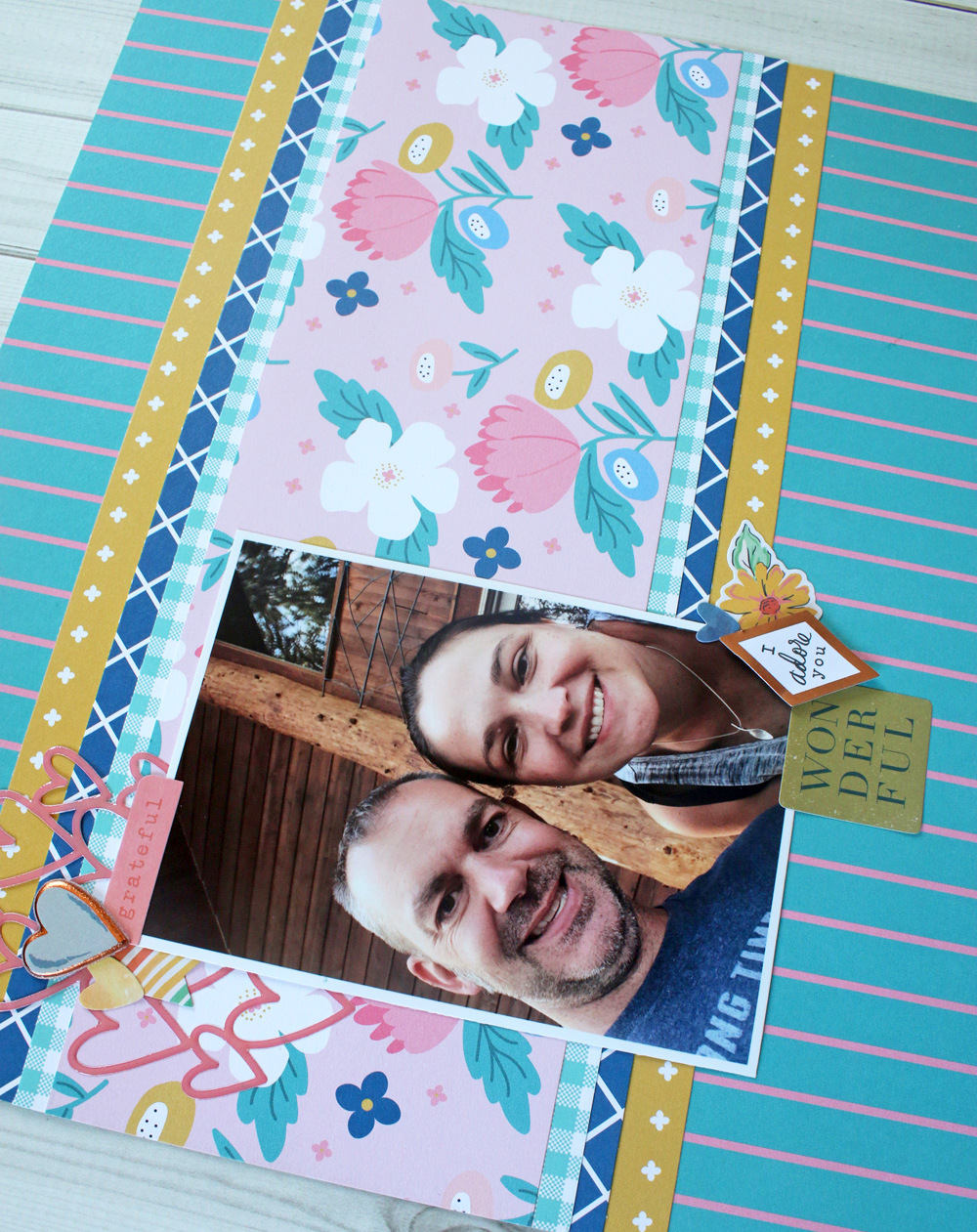
Sam is enjoying this month's kit. This kit is really fun for scrapping relationships with friends and significant others. This photo on this layout is just a picture of Sam and her husband hanging out on a deck at a vacation rental where they stayed at one summer.
She started with the blue and pink pinstripe paper for the base. Then, she cut a 4 1/2" x 12" piece of the pink floral paper. Next, she layered up strips of yellow, light blue, and navy blue paper behind the floral paper.
Also, she used the multi heart sticker from the upgraded embellishments to act as a frame for her photo. Then, she layered embellishments from the base kit and the upgrade kit on her photo and in the bottom right-hand corner of the layout.
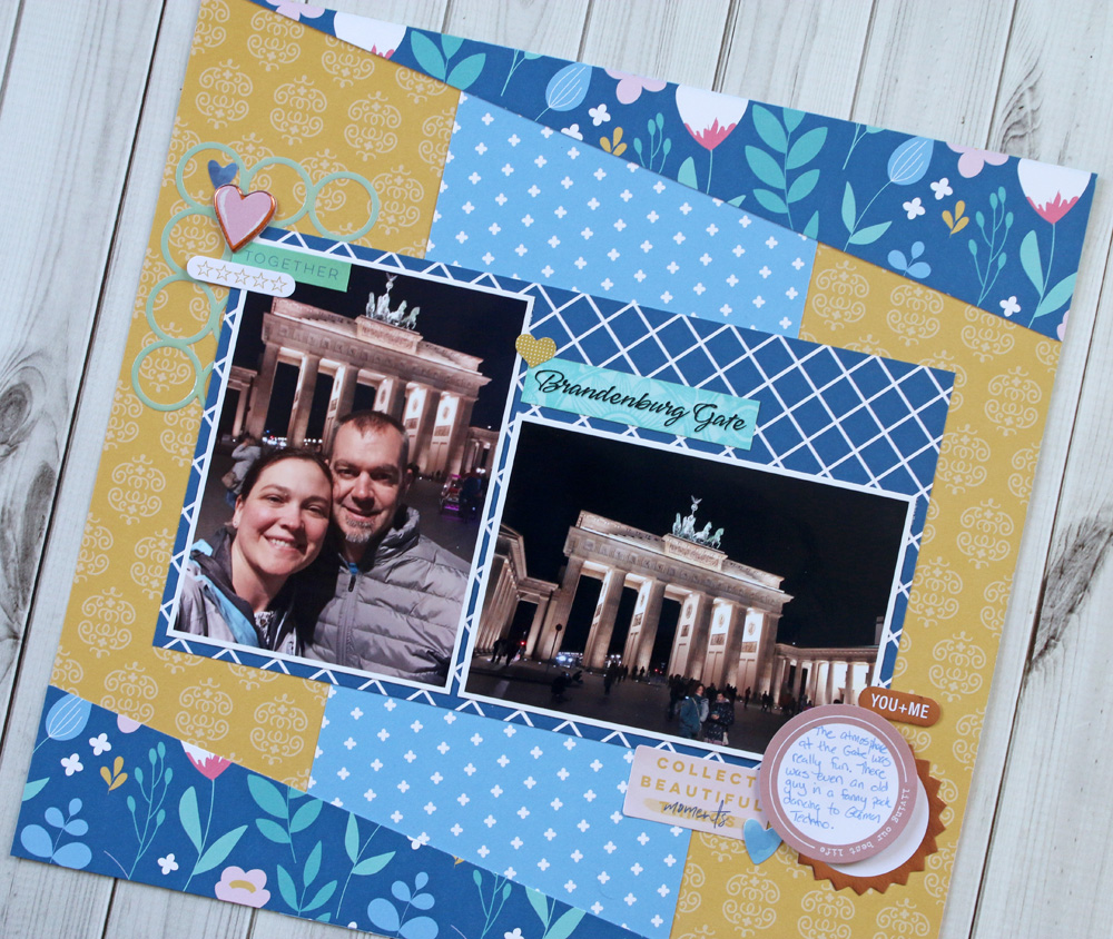
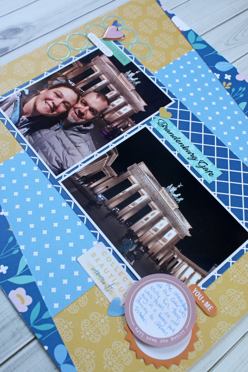
5. Brandenburg Gate Scrapbooking Layout
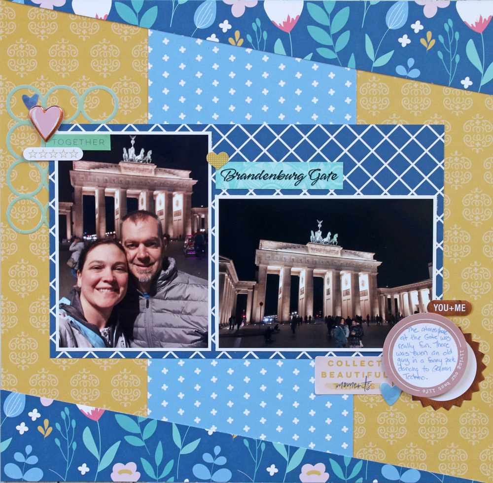
Samantha loves all of the textures she got with the embellishments this month. There are puffy stickers, epoxy stickers, shimmery stickers, gold foil stickers, and card stock stickers.
For this layout, she used all the different textures to add dimension to a simple layout. She started the layout by using the piece of yellow paper for the base. Also, she added a vertical strip of light blue paper about 5" wide down the center of the layout. Next, she took a piece of dark blue floral paper and cut a 2 1/2" x 12" strip.
Then, she cut that strip of paper diagonally from top right corner to bottom left corner. She added those cut triangle shaped strips to the top and bottom of the layout. She used a large rectangle of dark blue paper to frame her photos.
Finally, she finished up the layout by layering on lots of stickers from the base kit and the embellishment upgrade. Get to see more amazing scrapbook ideas on Sam's blog now!
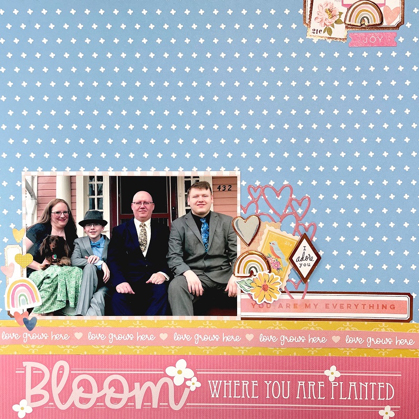
6. Bloom Family Scrapbook Layout by Sara Mishler - Sara Scraps
Sara started her layout by cutting the "Bloom Where You Are Planted and love grows here" strips. She flipped the paper over and cut a 41/4 X 61/4 mat for her photo. Next, she used the blue cross paper as a background. Note: DO NOT trim the branding strip!
Sara placed the "Bloom Where You Are Planted" strip across the bottom of the blue paper, covering the branding strip. This will give you a full 12X12 background.
Next, she cut a one inch strip of the yellow damask paper and layer the pink love grows here strip over the yellow. Also, she placed her matted 4X6 photo to the left of the page on the borders she created.
Using the copper labels from the Heidi Swapp sticker sheet, use them as a “base“. She created three clusters: one on the left and right of the photo and one in the top right corner. Finally, she used the stickers from the kit to create clusters close to the photo and to the top of the page too. She popped a few up on dimensional adhesive and used the "You Are My Everything" phrase sticker as her title. Watch more of Sara's beautiful family scrapbooking layouts on her YouTube channel!
Create happy and memorable moments with family and friends with this exclusive ScrapbookingStore collection. Visit our blog for more spring scrapbook layouts using our monthly kits!
Join our exclusive Facebook Community for Club Members. It will grant you access to amazing layouts and content made by our design team, fun monthly contests, and FREE Facebook Live tutorials to meet other crafters!
Haven't subscribed yet? Now's your chance, be sure to sign up today!
GET OUR MONTHLY KITS DELIVERED TO YOUR DOOR!
