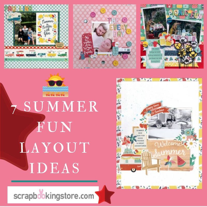
7 Summer Fun Layout Ideas
Summer isn’t over yet! And we have the best way to prove it.Our amazing design team created a series of beautiful layouts to give you all the inspiration you need! All the layouts below were made using our beautiful August 2019 kit which features the “Good Day Sunshine” collection by Echo Park. Check them out below!
1. Beach Day by Marci Bensing
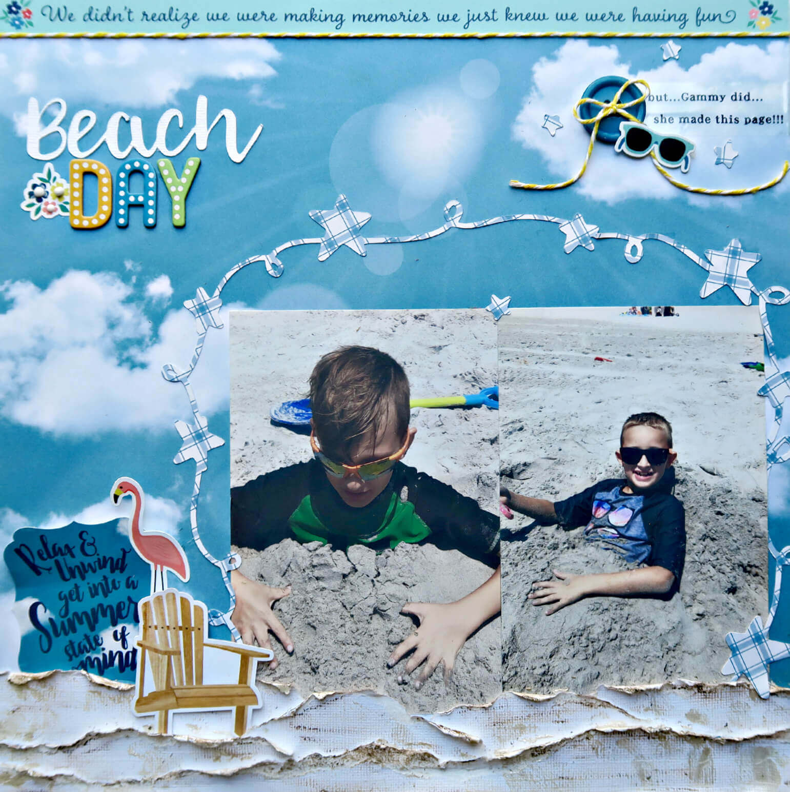
Here is a layout using the beautiful papers and embellishments in our August kit! It just went so well with the photos Marci took when she went to the beach with her 2 adorable grandsons.The cloud background paper reminded her of exactly what the weather was like that day 🌞
Marci started with a regular white cardstock from her stash, tore it and distressed it. She created the texture of the sand at the bottom of this page with some sporadic texture paste and a brownish distress crayon that she then smeared. Then, she placed the 2 photos of her grandsons.
She also used another sheet of paper from the base kit and her Silhouette Cameo to create the star circle around the cute photos. To the left of the photos she popped up some of the cardstock stickers and layered them.
At the very top of the page, Marci cut the strip about “memories” and lined it with a piece of yellow twine. Below that, to the right, she added a little humor journaling to go with that cut top strip. Next to it she placed one of the buttons from the upgrades with a yellow twine bow and layered the sunglass sticker.
As for the page title, Marci cut “BEACH” on the Silhouette cameo and used the Thickers letters to say “DAY” then tucked another flowers sticker. The perfect page layout for a perfect day at the beach!
Check out more of Marci’s beautiful layout ideas on her blog!
2. Picnic Fun by Melissa Bierlein
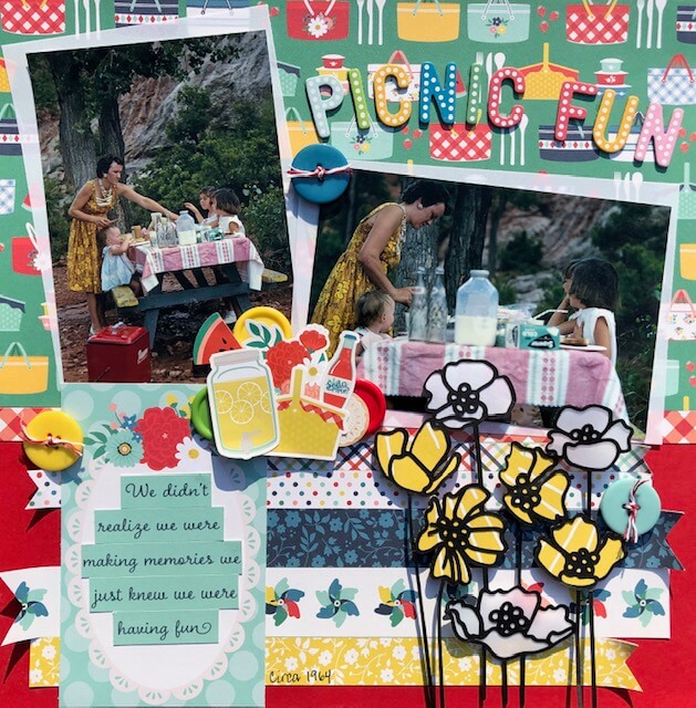
This layout showcases many gorgeous elements from the August kit. These photos were taken by Melissa’s dad on slide film way back in the day; circa 1964. Melissa’s dad took them on the absolute best vacations and to save money they would have a picnic for lunch every day! He captured these photos of a family lunch picnic on a trip out West.
As for the background, she used a 12X12 piece of red cardstock. Then, she cut a 7”X12” of the picnic basket patterned paper and adhered it to the top. She random cut sized strips of patterned paper to go under the picnic basket paper.
She also used a Stampin Up Banner punch to actually punch one end of each strip. Next, she adhered them to the layout and had them curl up against the edges where the banner was punched.
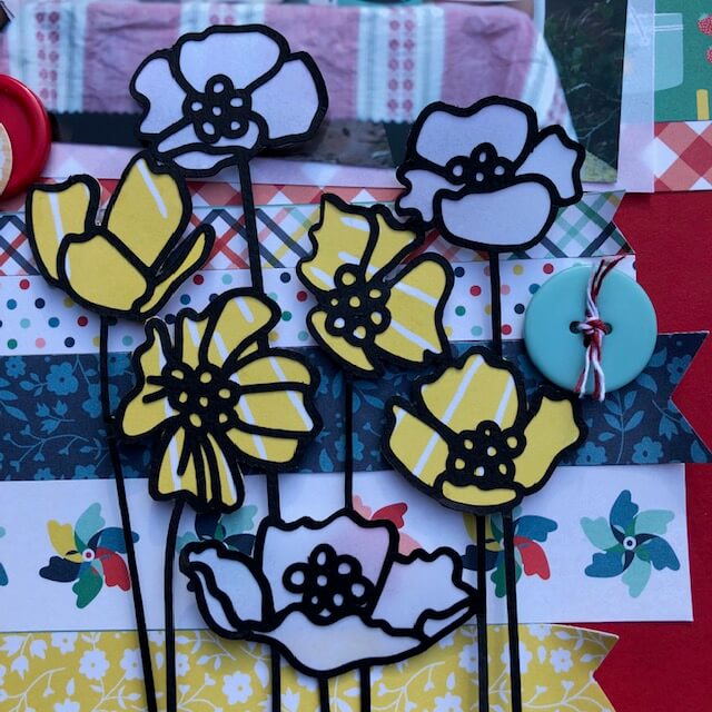
Melissa cut the poppy flowers using a Paige Evans cut file on her Cricut with black cardstock (not included in our August kit). She backed the flowers with vellum paper (also not included) and yellow paper from a journaling square in the kit. Next, she used the outside of the journaling square so none of the phrases showed. 💡 How ingenious!
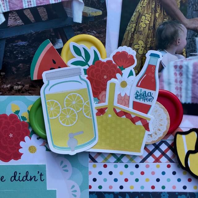
The cut file was adhered to the right side of the layout with pop dots. Then it was clustered with some stickers which went so well with the picnic theme of the photos. Also using pop dots on the stickers, Melisssa actually slipped buttons behind them so only thier edges show. Lastly, she added three-button upside down randomly across the layout and tied a twine (not included) through them.
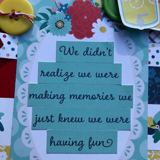
For the Title and Journaling, Melissa used the Thickers to spell out “Picnic Fun” in an arc above the photo. On the sheet of paper that had the borders was the perfect quote: ‘We didn’t realize we were making memories we just knew we were having fun’. She didn’t want it in a straight line so she cut it in pieces and adhered it to a journaling square before placing it on the layout.
Get to see more of Melissa’s amazing layout ideas and crafts on her Facebook page!
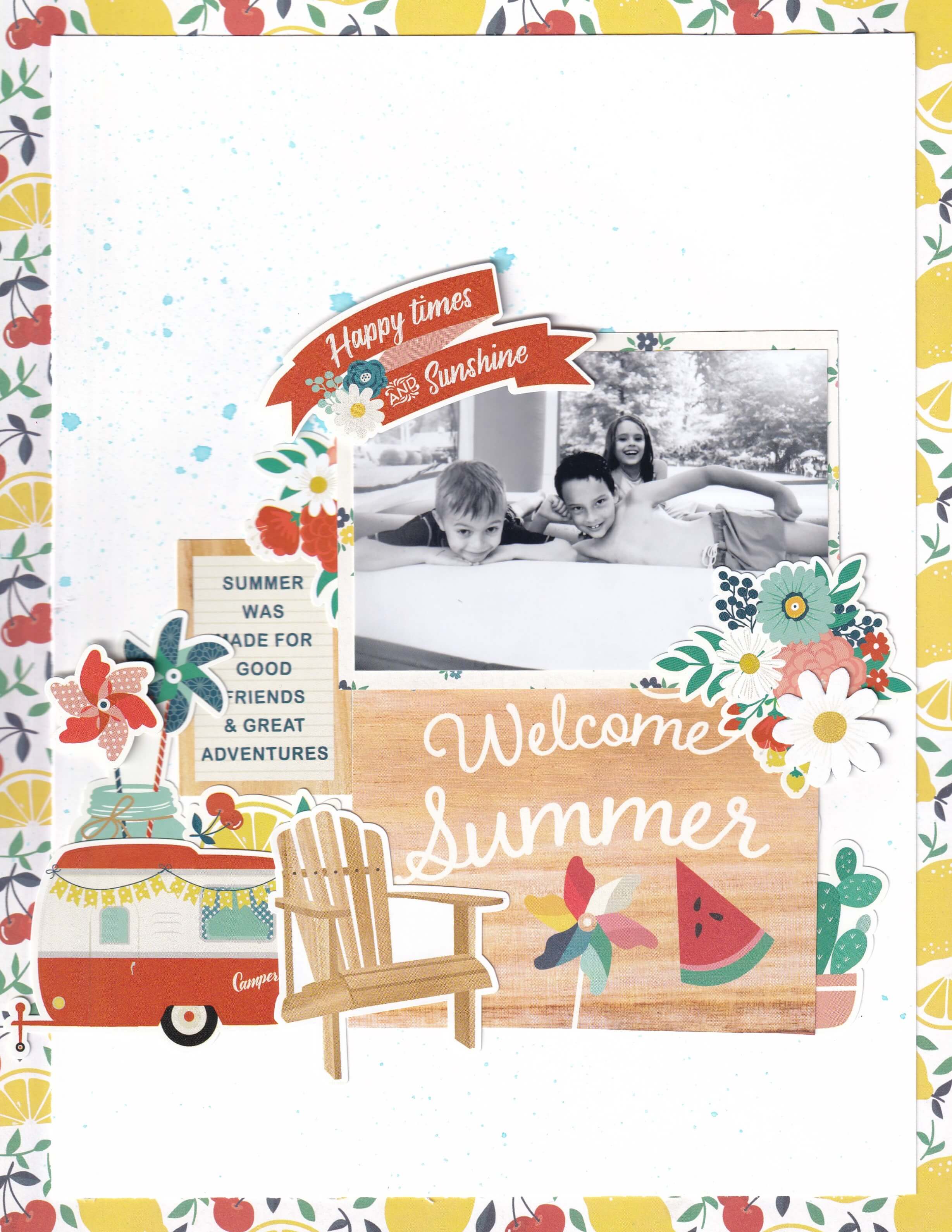
3. Happy Times by Nicole Martel
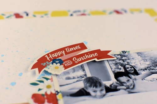
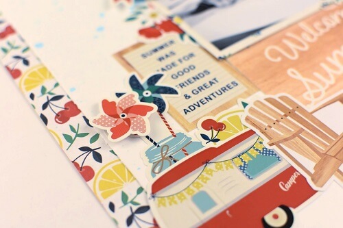
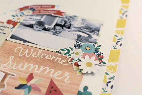
Nicole started the layout by cutting some lemon & cherry patterned paper to measure 8 ½”x 11”. She cut a sheet of white cardstock to measure 7 1/2×10”. Then, using the patterned paper as the base, mounted the white cardstock to the center of the base.
She also matted a 3 ½”x 4” photo using floral patterned paper. Next, she sprayed blue mist onto the white cardstock. Then, she cut the “Welcome Summer” sentiment from the cut-apart sheet. She moved on to adhere the mat approximately 1 ½” from the bottom of the white cardstock, approximately 1” from the right side of the layout.
To complete the layout, she adhered stickers using foam squares to add dimension and adhered matted the photo above the mat so that the photo lines up above the Welcome Summer. Check out the tutorial below!
4. Together Layout
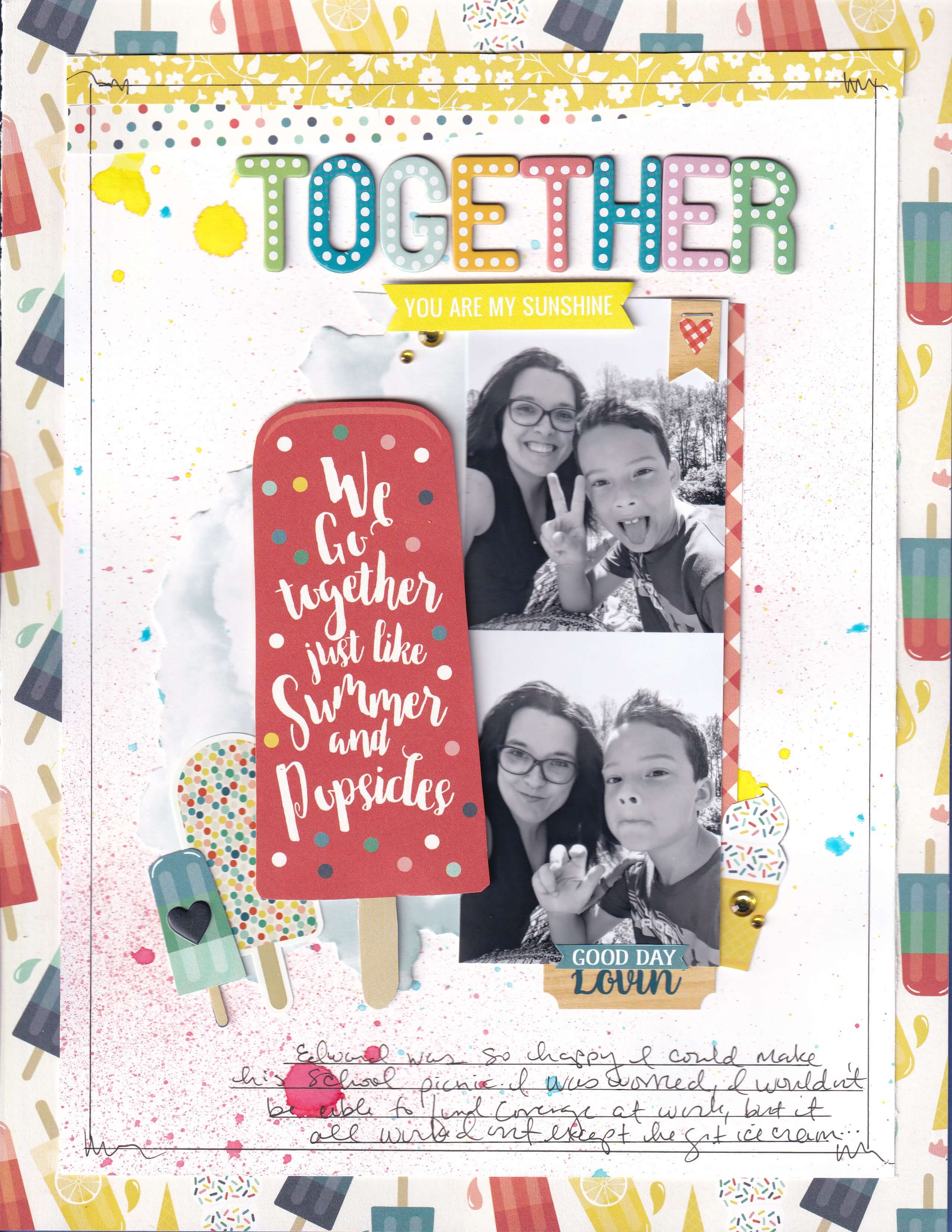
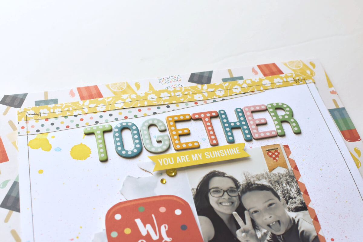
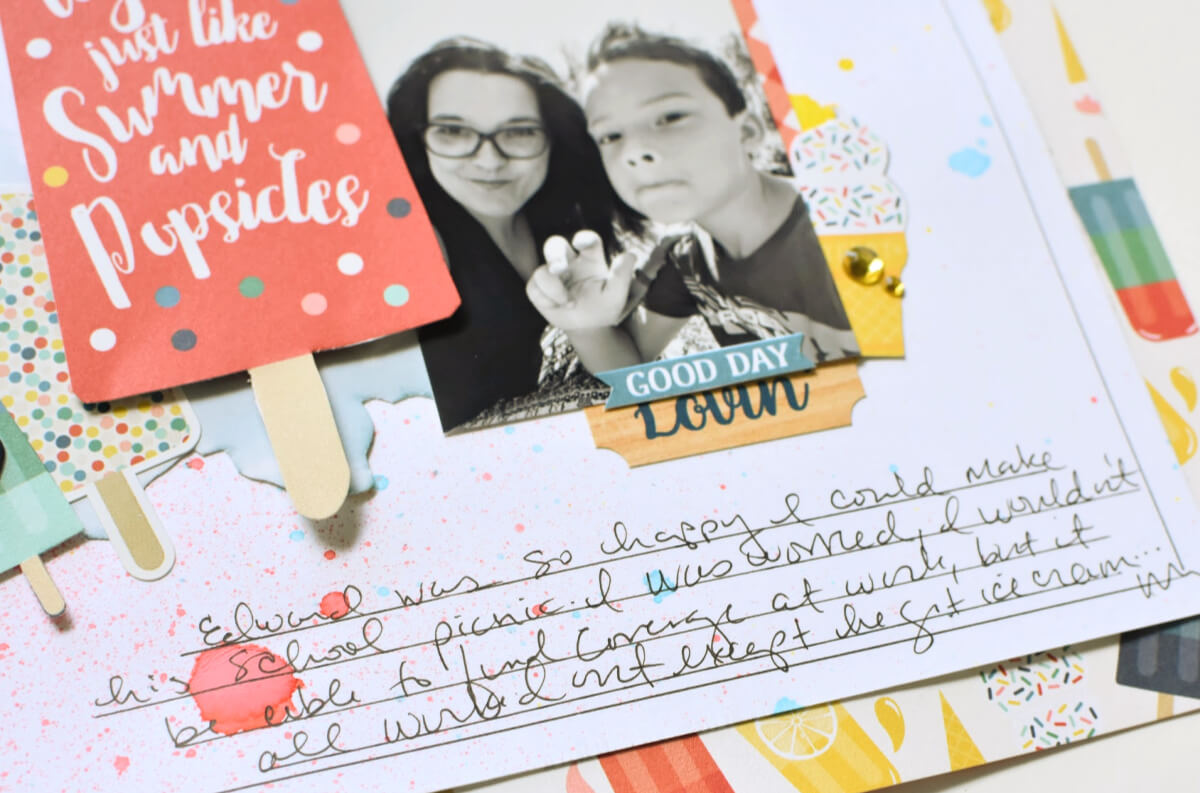
Using the Popsicle patterned paper as the base, Nicole cut the paper to measure 8 ½”x11”. She cut a white cardstock to measure 7 ½”x10” and mounted this to the center of the base. She also cut two ¼” x 7 ½” strips and adhered them at the top of the layout (white cardstock). Next, she cut the cloud patterned from the patterned paper and the large “We Go together just like Summer and Popsicles” sentiment from the cut-apart sheet.
Then, Nicole sprayed white cardstock with blue, red and yellow spray ink and mounted the cloud image to the center of the layout, turning it sideways. Next, she adhered two wallet-sized photos vertically, along the edges of the cloud. She also cut a red and white strip from the patterned paper to measure 6”x1/4” and adhered it along the right side of the photo strip. She also adhered a large popsicle to the left side of the photo strip using foam squares.
To complete the layout, she adhered stickers, Chipboard letters, gems and journaling. Some of the elements can be fussy cut from patterned paper. She used a Foam Square to add dimension and used a pen to hand-journal at the bottom of the layout. Watch the tutorial below and follow along!
Check more of Nicole’s gorgeous layout ideas on her blog and watch more of her tutorials on her Youtube channel!
5. Summer Sunshine by Rosa Kelly
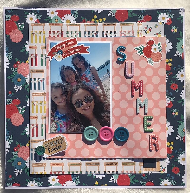
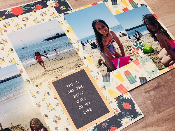
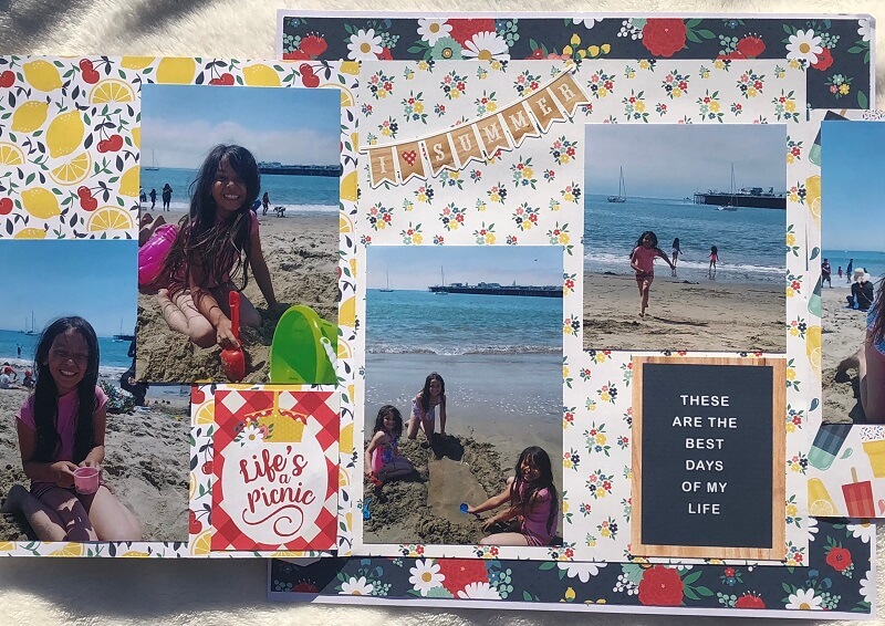
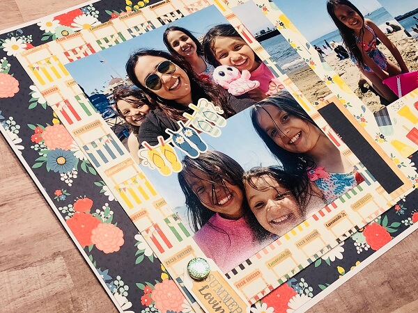
Rosa got her inspiration from the beautiful vibrant colors of the August collection which went well with her beautiful daughters’ smiles. She started with a sheet of 12×12 and trimmed it to 11 ¾” x 11 ¾”. She then backed it on a white 12×12 sheet to make an outline frame. Next, she cut a sheet of paper at 8” x 8 ½”. Then she scored at ½” and added it at the right side of the layout (make sure to stay 1” away from the edge!). She also cuts another design sheet at 10” x 7”. Scored it ½” along 7” and added to the left side (again, stay 1” away from the edge).
Then, she cut another piece to place in between the two opening pages to cover the hinges added. This piece measures 9”x 10”. Rosa used the chipboard stickers to spell out the word “SUMMER” and used the buttons to make the page colorful and fun.
Next, she used a cute sticker back on white cardstock and attached it to the page using a brad from the kit. This moving mechanism will help the page stay closed. Finally, she used the cards from the collection to cover the back of the brad and to embellish the inside of the layout. Check out the tutorial below and follow along with Rosa!
Get to see more of Rosa’s creative layout ideas and awesome cards on her Youtube channel!
6. Camping by Sam Taylor
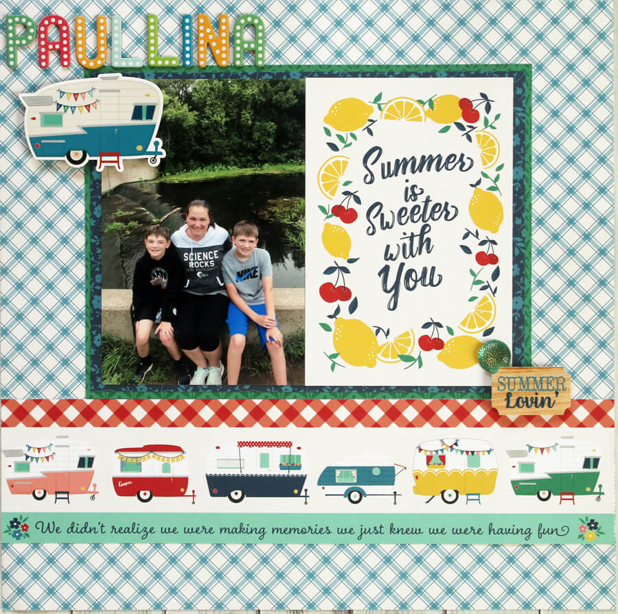
Sam does a lot of camper camping in the summer, so she was super excited to get this month’s kit. Not only are the colors gorgeous (deep and saturated), but there are these adorable campers throughout the collection that just speak to her and her many camping photos.
There’s also a great 12″ x 12″ sheet of stickers that comes with the standard kit and a fantastic set of alphas that come with our August 2019 Kit Upgrades.
She started her layout by trimming the Happy Camper to 8 3/4″ x 6 1/2″ and trimmed the Little Red Wagon to 8 1/2″ x 6 1/4″. Then, she layered the trimmed piece of Little Red Wagon onto the trimmed piece of Happy Camper and adhered to a 12″ x 12″ sheet of Festive Floral. She also adhered a 4″ x 6″ photo and a 4″ x 6″ Journaling Card to the piece of Little Red Wagon and cut a 12″ x 3″ strip of Border Strips, layering it underneath the piece of Happy Camper.
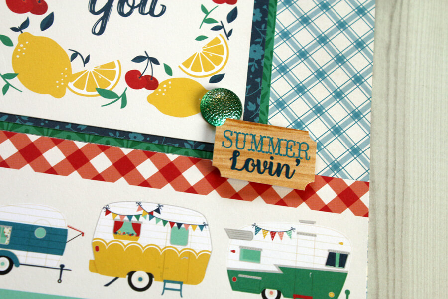
Sam used a dimensional adhesive to add the Summer Lovin’ sticker to the bottom right corner of the photo and then added a brad to the corner as well. Lastly, she put her title in the upper left-hand corner with Thickers and used a dimensional adhesive to add a camper sticker underneath the title.
Want to see more of Sam’s awesome layout ideas? Check out her blog!
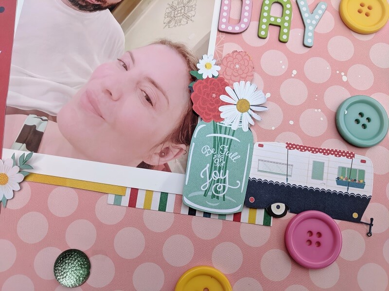
7. The Every Day by Tuesdae Hubbard
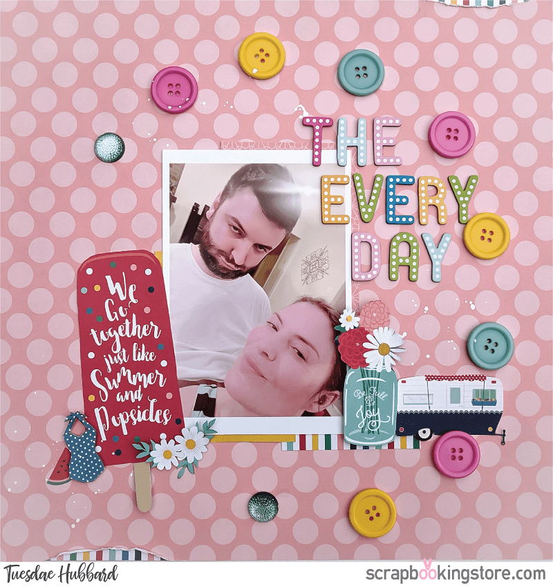
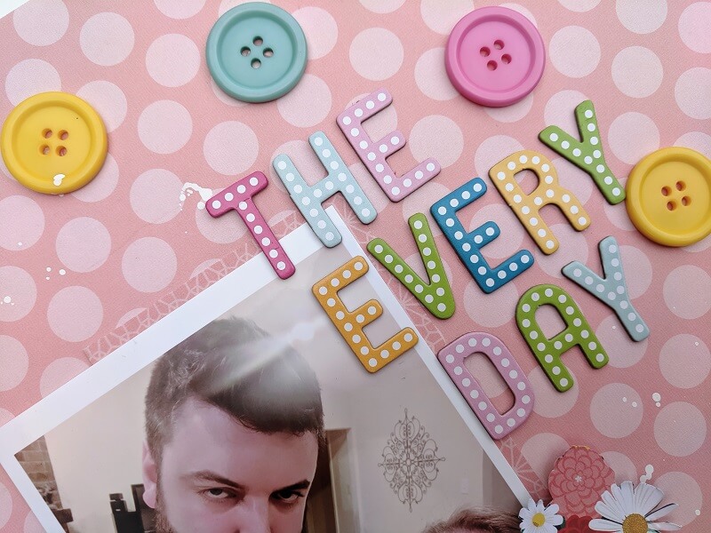
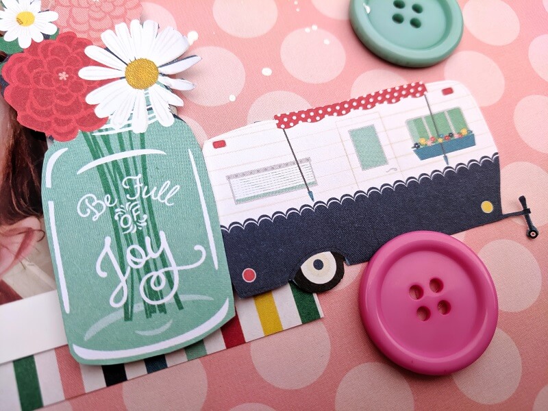
Tuesdae chose her papers based on her favorite colors from the August paper collection. She loves pink and yellow so anytime there is a somewhat neutral photo, she reaches for those colors. The buttons for embellishments matched perfectly and added a great deal of dimension and a bit of happiness. She couldn’t resist fussy cutting out the cut aparts and popping them up for added dimension on her layout.
The photo is a picture of BAB and Tuesdae in their kitchen just doing their “day to day” activities and enjoying time with one another. Tuesdae first reached for the papers she loved and decided which pieces to fussy cut and where she wanted her clusters.
Tuesdae wanted the layout to have a visual flow to it so she knew the buttons in a circle would allow the photo to be the highlight of the layou, while drawing one’s eye to the great photo. She loves our scrapbook kit collection because it is bright and colorful so it just puts a smile on her face!
Learn how to do this wonderful layout below and follow along with Tuesdae:
Tuesdae’s favorite photos always seem to be every day or summer themed, so the Echo Park’s Good Day Sunshine in our August 2019 kit is just perfect for her. Check more of her tutorials on her Youtube channel!
OurDesign Team members came up with several great layout ideas this month! Check more summer-themed scrapbook layouts on our blog!
Get a chance to join our crafters and scrapbookers Facebook community to gain access to all our layout ideas, contests, and upcoming events
We host Facebook Live Scrapbook and Cardmaking tutorials every month. Like our Facebook page to get more updates!
Subscribe now to get creative monthly kits delivered right at your doorstep! And don’t forget to upgrade.
