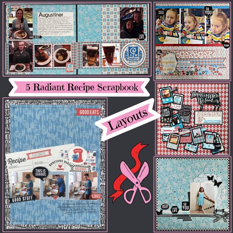
This April 2019 ScrapbookingStore.com Kit is full of gorgeous cooking themed papers and our Design Team has been having a blast creating 12x12 layouts with this kit. These Radiant Recipe layouts are from our prestigious Design Team members Becky, Marci, Nicole, Sam and Melissa and were made using the gorgeous collection called Ingredient by Authentique!
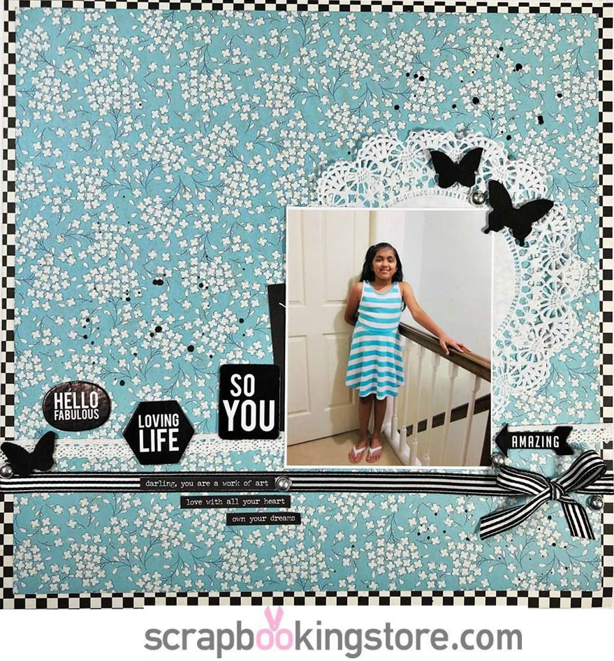
1. Monochromatic layout by Becky Bacchus
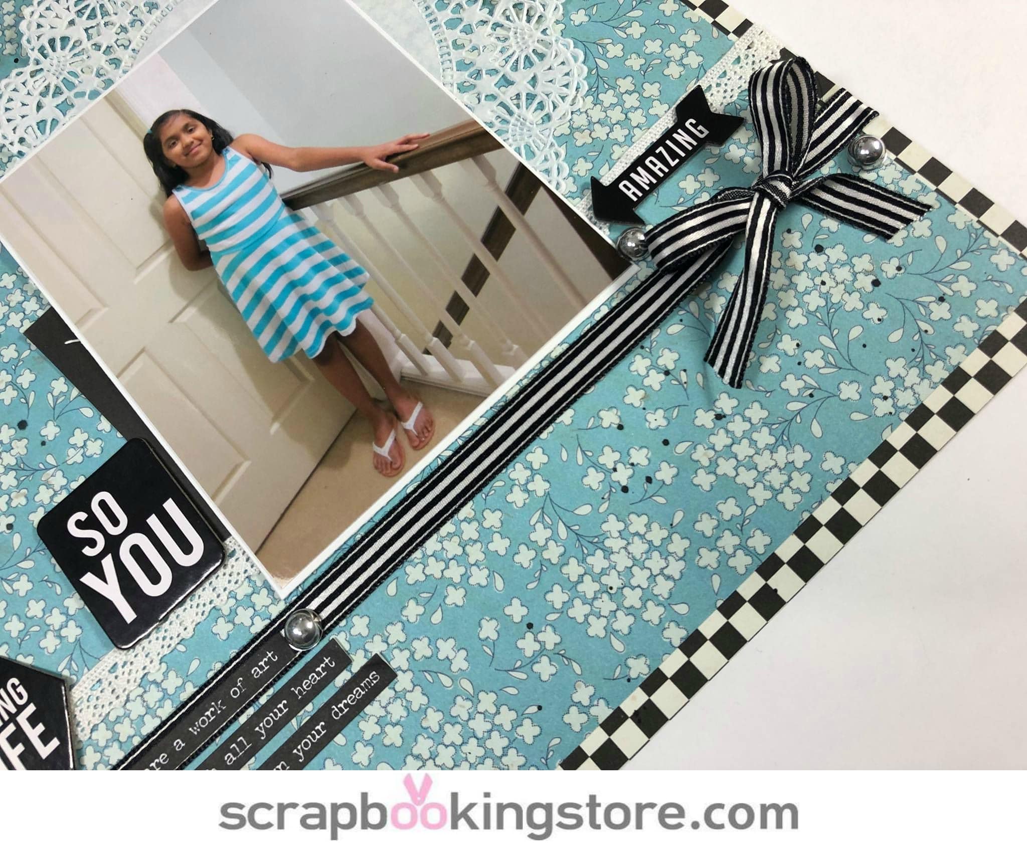
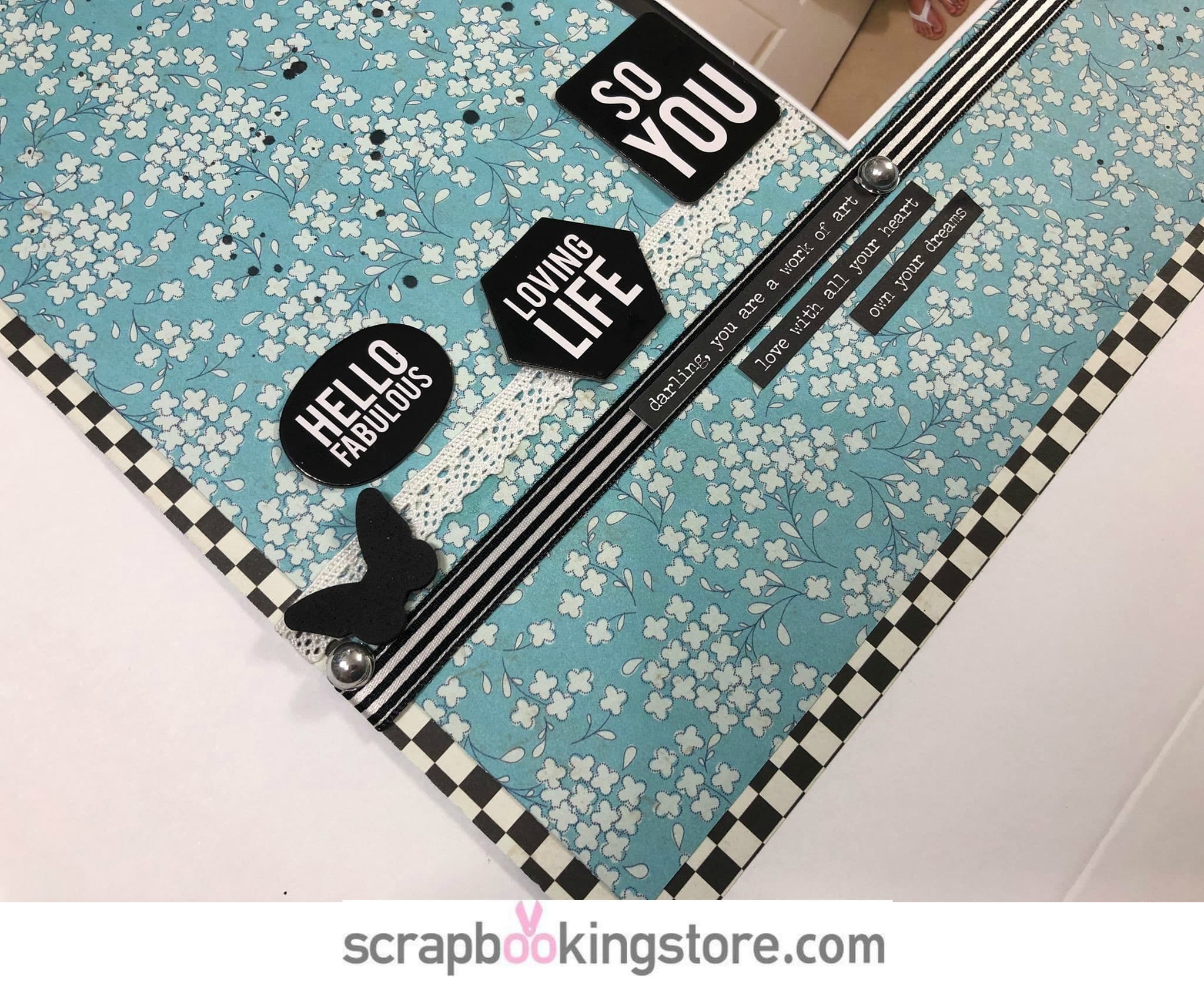
Becky loved the bright colors and theme of this month's kit. So, she did a Monochromatic layout using the beautiful teal patterned paper and adding in the black, white and some silver.
She began the layout by matting her photo on white cardstock and trimming 1/4 inch on each side of the teal patterned paper that was included in the April 2019 kit. Then, she matted the teal patterned paper onto the black and white patterned paper loving the contrast that bold black and white added.
Next, she added a ribbon and some butterflies from her stash. The word phrases and silver enamel dots were also added on the layout that came with the kit. To add a finishing touch, Becky added some black splatters using India Ink. She loves how this layout turned out.
If you would like to see the complete process of this monochromatic layout, check out the video below and follow along with her.
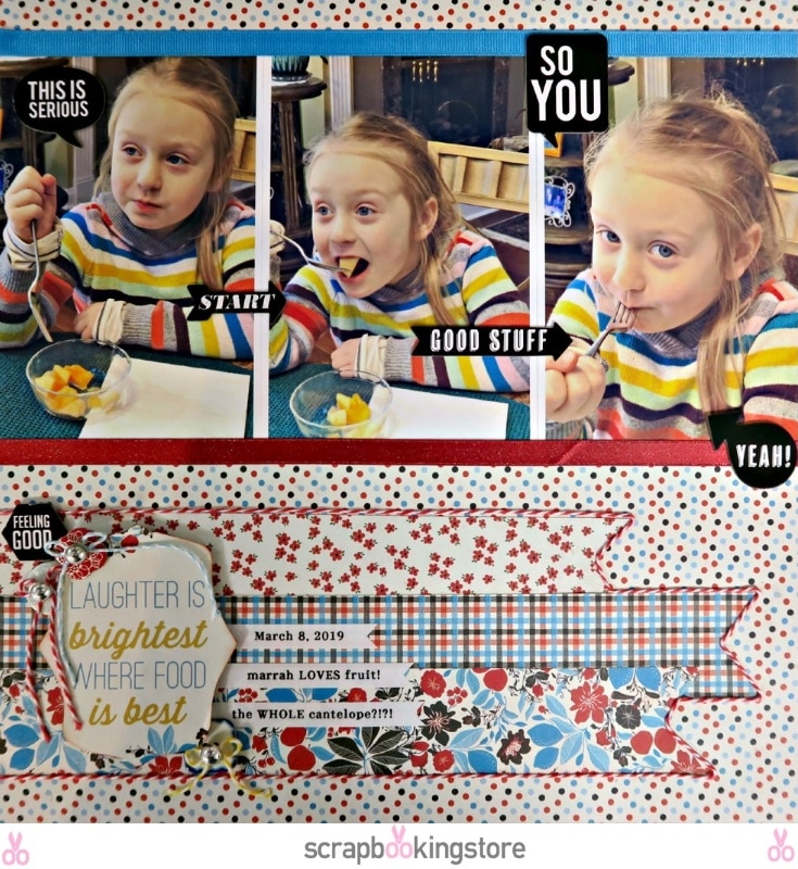
2. Fruity Obsession layout by Marci Bensing
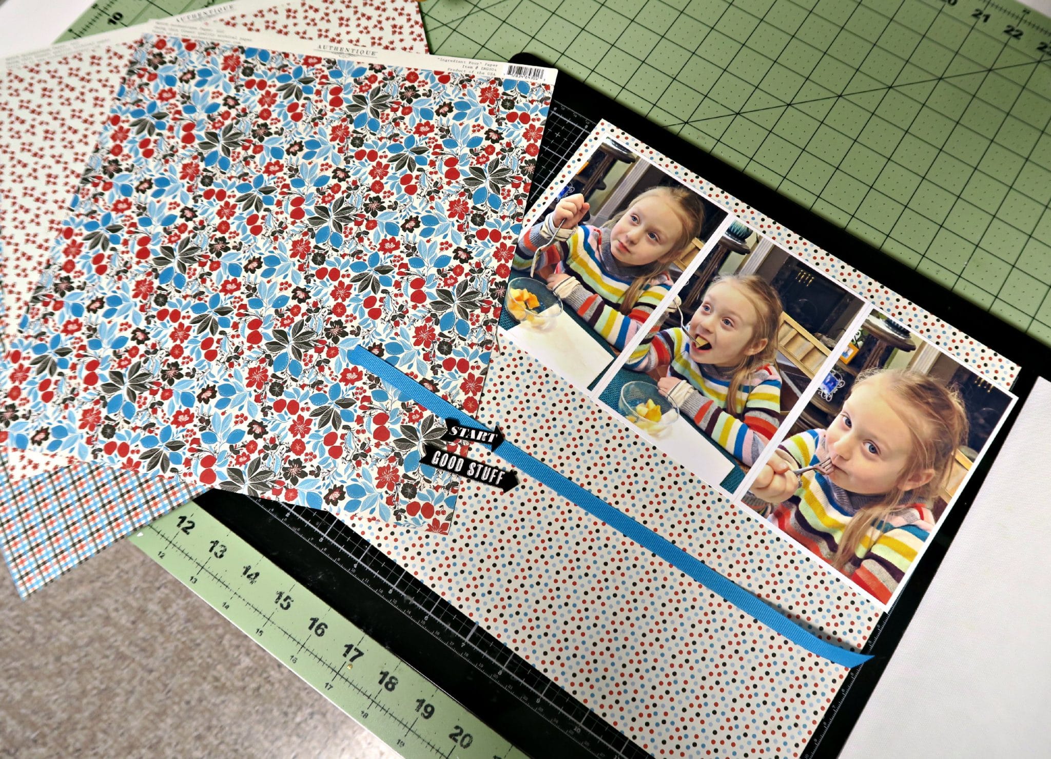
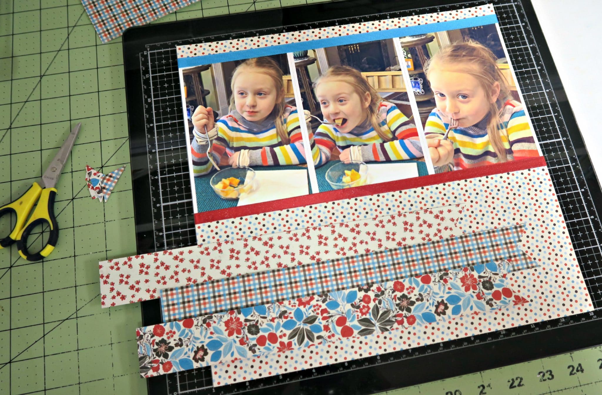
Marci made a gorgeous layout of her niece using the beautiful papers and embellishments from the April kit collection.
First, she put together the basics that will become the starting point for her page. She adheres to those beginning elements and decides from there as to what she will add. After adhering the blue ribbon, she decided to add a red one as well. Then, she started to create banners as she had been inspired by a sketch with 3 large banners.
Then, she added more of the words and bubble words by Heidi Swapp that were included as an upgrade for this months kit. Also, she bordered the banners with twine so that they stood out more. She fussy cut one of the sentiments from the Authentique paper and popped it up on the banners and then surrounded that with the Pebbles buttons threaded with twine bows placing a Heidi Swapp gem in the center. Marci goes with the flow here- letting the layout evolve as she goes along. Finally, she added some journaling strips to remember the details for that moment.
Check out more of Marci's fun layouts on her blog.
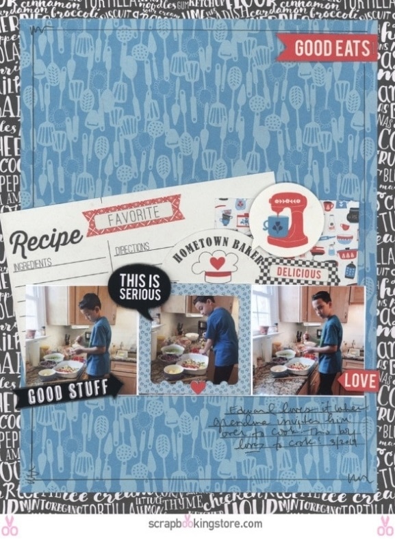
3. Little Chef Layout by Nicole Martel
For this cute young chef layout, Nicole used the blue paper with kitchen supplies printed on them and added the Recipe tags behind the photos. Then, she added some stickers from the sticker sheet included in the kit and added some Heidi Swapp Chipboard Phrase Stickers that were included as an upgrade in the kit.
Last, Nicole drew some lines as borders and hand wrote a short memo on the layout. Watch the tutorial belwo on how Nicole played with this layout of her young chef son and don't forget to visit her blog to see more awesome layouts.
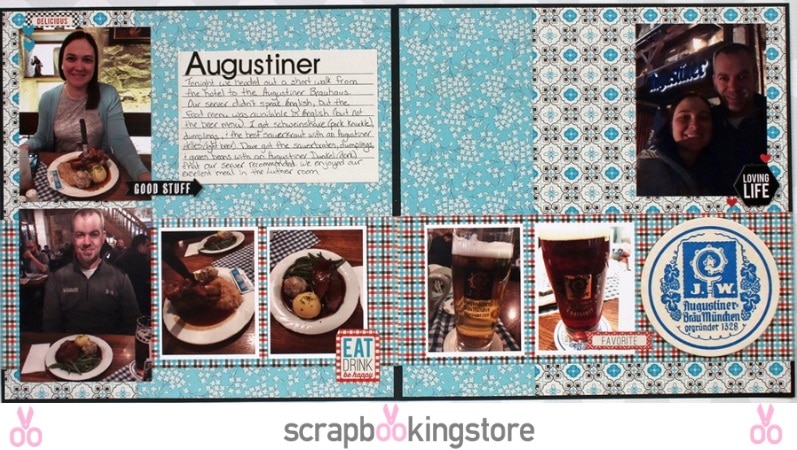
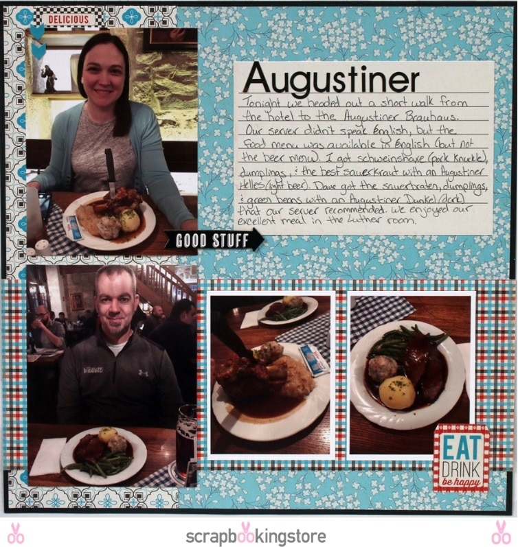
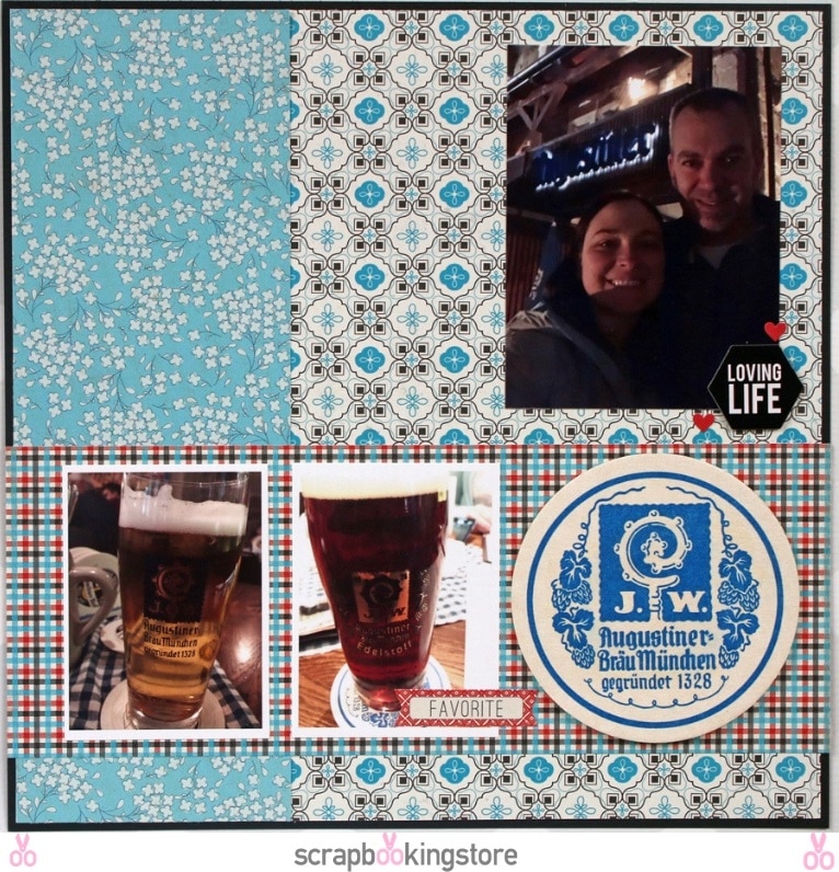
4. Germany Trip Layout by Sam Taylor
Sam was blown away with how versatile this month's kit is. So, she decided to make a two-page layout focusing on the bold patterned papers.
She started the layout by deciding on the colors she would use. She picked blue, white and black as her main colors and added pops of the red from the kit as an accent.
Since Sam had a lot of photos to fit in (even for a 2-page layout), she used a mix of "3x4" photos and "4x6" photos. For embellishments, she used card stock stickers from the core kit and chipboard stickers from the upgraded kit. Check more of Sam's beautiful layouts on her blog!
5. Hometown Food Layout by Melissa Bierlein
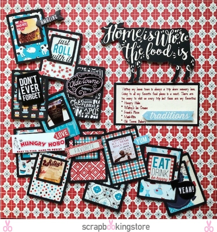
This layout is all about the FOOD! Traveling to her home town to visit family always involves going to some of Melissa's favorite restaurants from her childhood!
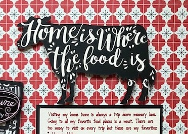
Melissa decided to showcase those long time favorite places in this layout using the April kit. All papers and products used are from the kit except for the black and cream cardstock and the black vinyl she used on the cow. For that adorable cow, she used the April free cut file ("Home is where the herd is") as the title and changed out the word ‘herd’ to ‘food’. We all love that cow!! Club members can download this cut file here.
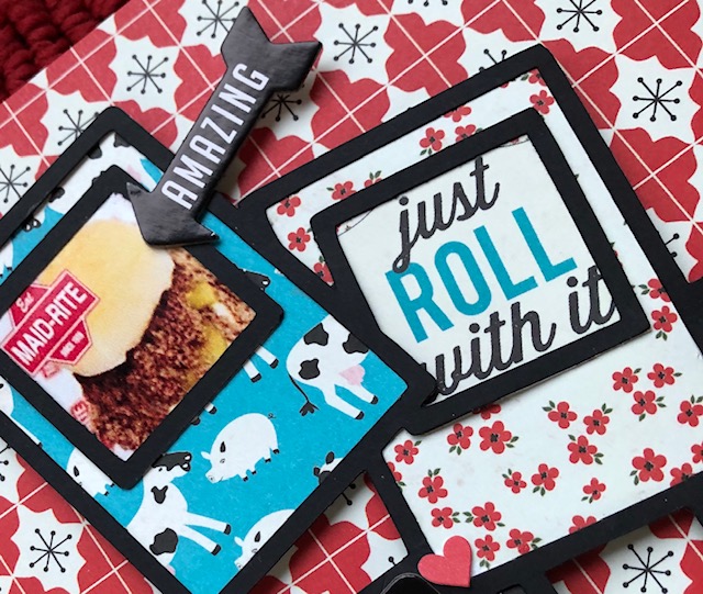
Finally, Melissa also used a cut file from Virginia Walker for the cascading photo frames. She tried to showcase as many of the patterned papers from the kit as she could on this layout. To see more of Melissa's wonderful layouts, checkout her Facebook page!
These are the only first layouts for April from these talented ladies, more will be posted on our Facebook Page exclusively for club members. We hope you enjoyed these and are inspired for your own layouts! Be sure to follow us on our social accounts Facebook, Instagram, YouTube and Pinterest to see more amazing projects.
If you haven't joined us yet and want to get great kits like this every month, just click the button below!
here...
