10 Scrapbook Ideas for the New School Year
Fall’s here and this means two things:Back to School and Football! Whether you’re scrapping a loved one’s first day of school or capturing important milestones, we’ve got your back with our September kit, Scholastic collection by Authentique. Keep reading to see how versatile this boy-friendly kit really is.
Spark your creativity with the gorgeous designs made by our awesome Design Team members.
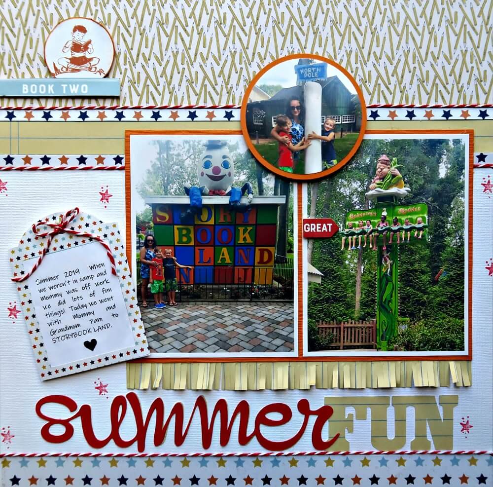
1. Summer Fun by Marci Bensing
The very first example of versatility is given by our very own Marci who created this beautiful layout of her grandsons trip to Storybook Land.
She started her project by pulling together her “base” and gathering all the materials she would use. Then she pieced and adhered everything together which was a whole lot of fun! Notice that she used 3 different patterned papers that came with this month’s kit. Everything was placed on white cardstock. If you’ve been following our posts you know that Marci uses twine in 90% of her layouts – it’s a must for her!
For the effect under the 2 photos, Marci used a fringing scissors. Then, she used the star frame sticker on the left for her journaling and adhered it to the back of the frame. Next came the twine bow to complete the look which was popped up and angled to match the journalling. The title, Summer Fun, title was created on the Silhouette Cameo. To finish this layout off, she stamped several stars with one of her stock stamps using red ink.
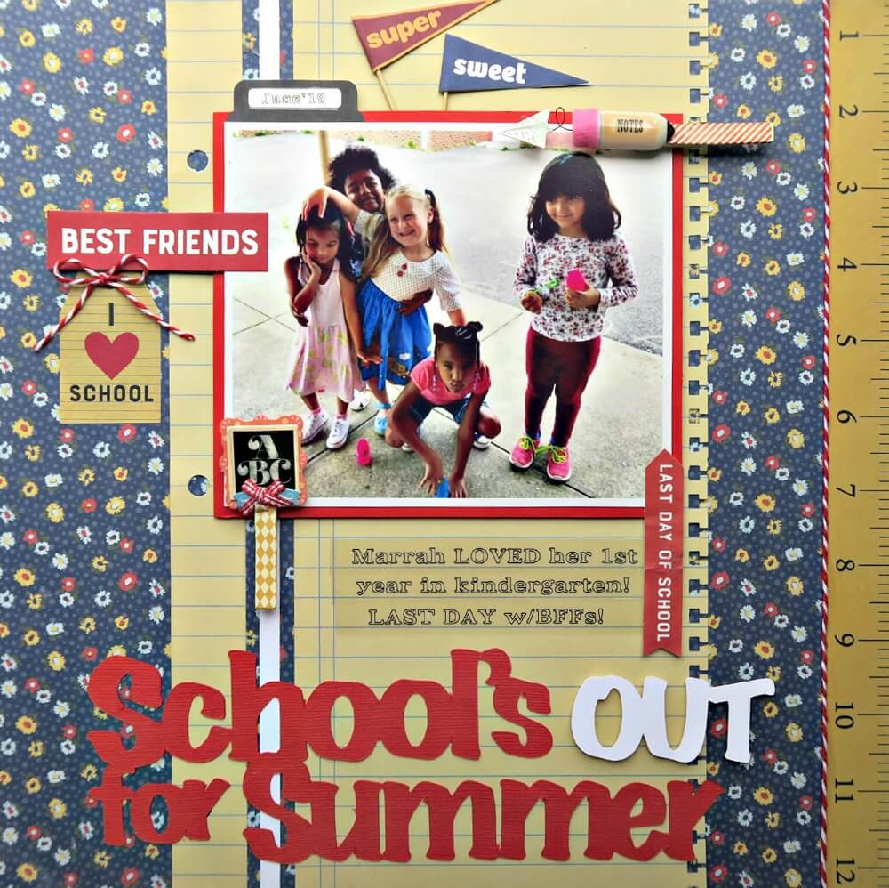
2. I Love School Layout
When she received her September scrapbook collection, Marci remembered an adorable photo her brother posted of his daughter’s last day of school this past June. Her creative process starts with sorting through all the beautiful papers and embellishments to create her “base”.She told us that this is the most difficult part of the process and after this is done, the rest is a breeze to complete! She chose the base background paper ( blue floral), then a sub-base paper ( yellow notebook paper which she punched with a notebook paper punch). Next, she placed her photo which she matted with cardstock.
Now to start embellishing: Marci placed some flags, clothespins and on the right-the ruler paper strip.
How she finished it: She cut the title using cardstock from her Silhouette Cameo (that is a song too – anyone remember?!) Marci then worked all around the photo to add various embellishments until she felt the page was balanced. You will notice bits of twine which is a signature for her on about 90% of her layouts! The journaling was done with a P-Touch label printed using clear tape.
Check more of Marci’s awesome layout projects on her blog!
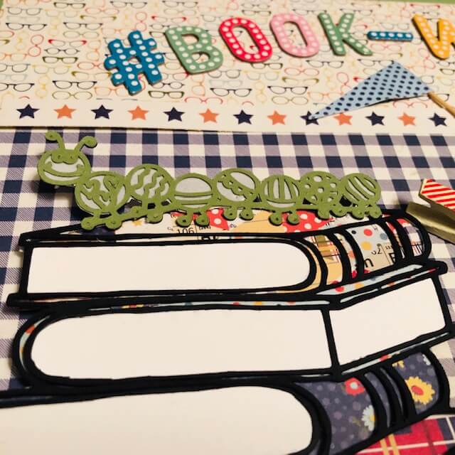
3. Book Worm Layout by Melissa Bierlein
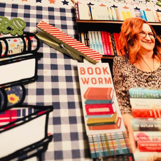
Our so much more than back to school scrapbook collection is great for READING layouts too!!! And Melissa is such a bookwork. She loves the fact that she works with books every day and she makes it a habit to read every night.
Melissa used the ‘eyeglass’ paper and cut it down 3/4” on two sides; then centered it on light green cardstock. The blue check paper was cut to 10.5” X 7″. The star patterned paper was cut into strips and used two strips of the blue and orange stars on the top and bottom of the blue check paper.
The stack of books is a cut file from Paige Taylor Evans and is perfect for this layout. This was cut out of black cardstock. She backed the edges of the books with white cardstock and the books themselves with patterned paper from the kit. The Bookworm is part of the cut file and was cut a second time in green and backed with vellum.
Her journalling was printed on a transparent sticker and glued to the yellow lined patterned paper with a Zyron. Since the Zyron covers the entire back of the tranparent paper, there are no glue lines that show. The stack of books, photo, journaling and die cuts were all popped up with foam dots. The flags are stuck in the foam dots too. The book worm sticker is attached to the photo with one of the clothespins from the Upgrades. Melissa used powder on the back of the sticker so that they don’t stick to the photo.
Title ~ Do those Thickers look familiar??! They are from our August kit and worked perfectly with these papers. Check more of Melissa’s gorgeous projects on her Facebook page!
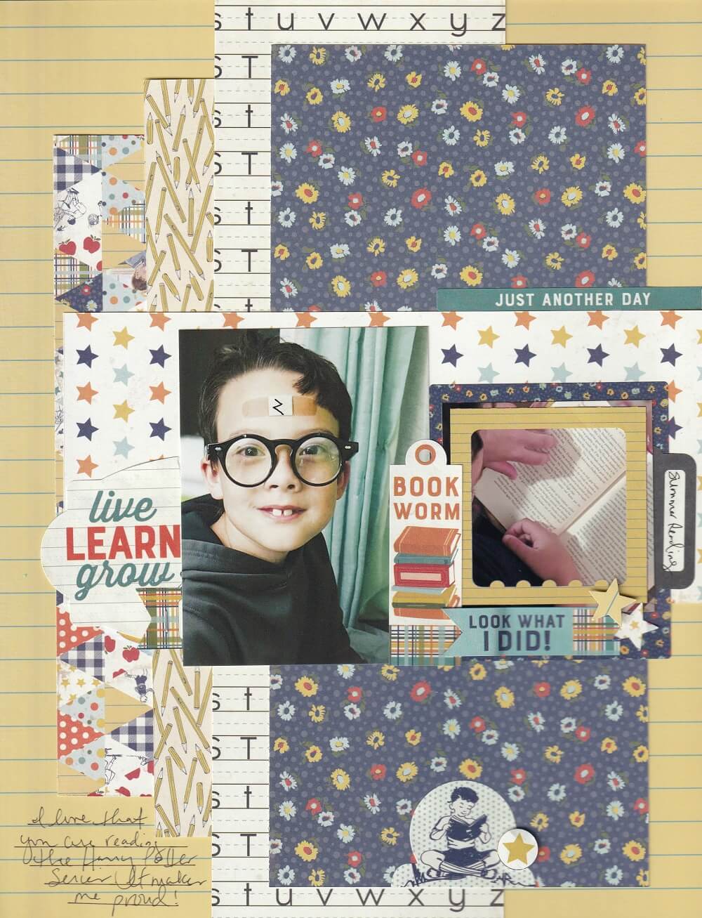
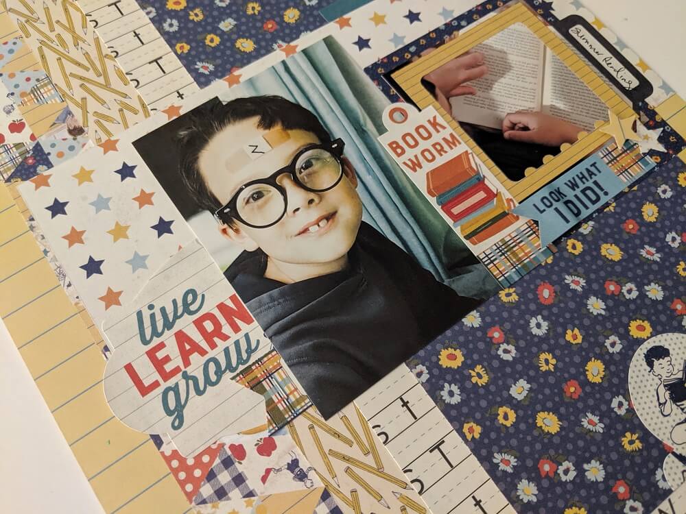
4. Just Another Day by Nicole Martel
Nicole cuts six rectangles from pattern of choice to measure 7 3/4″x2″, 9″x2″, 8 1/2″x3 1/2″, 10″x4 1/2″, 7 3/4″x3 1/2″ and 3 1/2″x11″. She mounted the two smallest rectangles as shown, 1″ from the left side of the base, starting with the smallest. Next, she mounted the 3 1/2″x11″ strip to the center of the layout and mounted the 7 1/2″x3 1/3″ strip as shown. There should be four vertical strips in total and one horizontal strip.
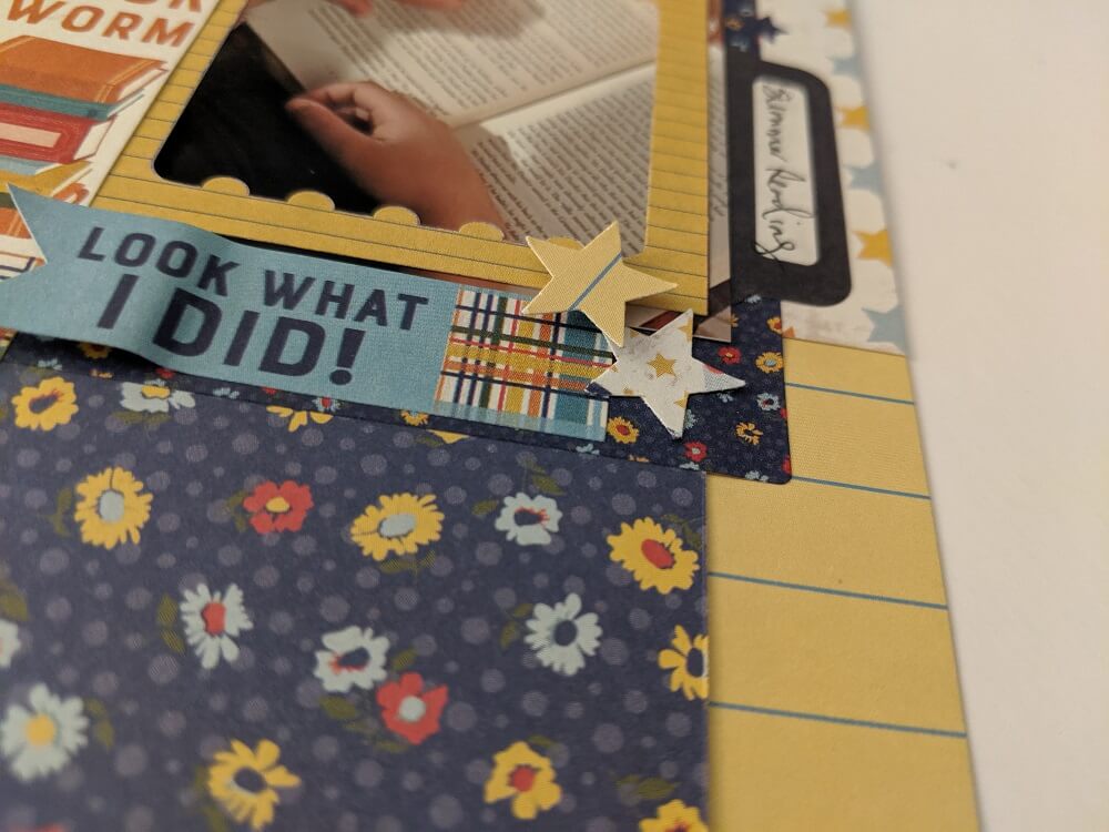
She added her favorite embellishments using a few foam squares. She then used a star punch to punch two cute stars and adhere them to the layout using foam squares and glue. Lastly, she used a ruler and black pen to add journaling at the bottom of the layout.
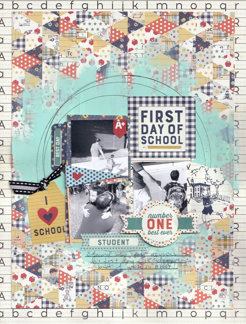
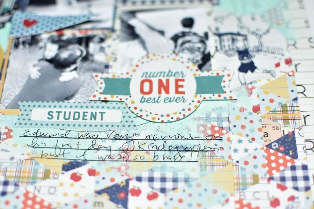
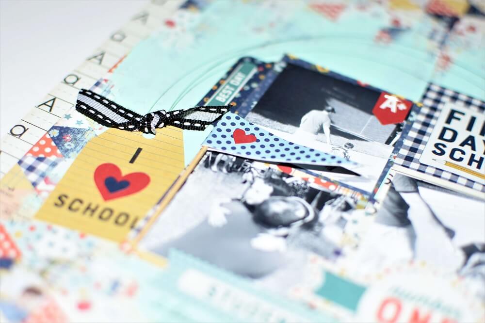
5. First Day of School
Nicole used the ABC patterned paper as the base for this beautiful layout and cut the paper to measure 8 ½”x11”. Then, she cut the multi-patterned triangle paper to measure 7 1/2×10” and adhered it to the base. She used a paintbrush and some turquoise blue paint to cover the center of her layout, allowing the paint to dry for five minutes.
Then, she used a plate or circle templates and a black pen to draw circles directly in the center. Next, she matted the three 2”x2” photos using scraps of patterned paper and placed them inside the circle as shown. She embellished her design using foam squares to add dimension. Lastly, she used a ruler and a black pen to journal at the bottom, below the photos.
Watch how Nicole did the layout! Grab your materials and follow her along:
To see more of Nicole’s wonderful scrapbook collection layouts, check out her blog!
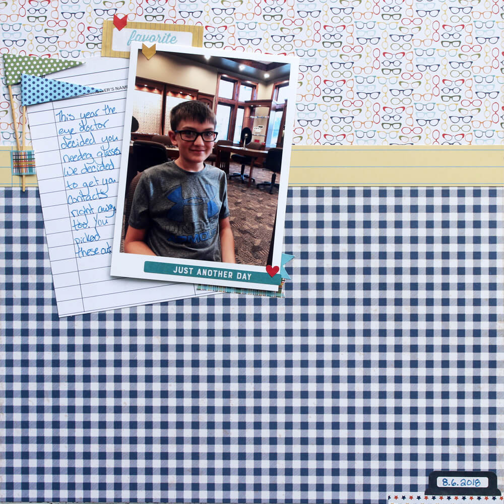
6. Glasses Layout by Samantha Taylor
Plenty of time to create a back to school layout! Sam had other priorities and she created one about her son’s first set of glasses. As soon as she saw that patterned paper, she knew that it was perfect to capture this great memory. The glasses paper forms the base of her layout. Then, she layered the blue plaid paper onto the bottom 2/3 of the paper. She also used the yellow notebook paper as an accent strip, taking care to trim the paper so there was a blue line at the top and bottom of the strip.
Next, she layered on a journaling card and attached her photo over the top of it with dimensional adhesive. Finally, she added accent stickers from the sticker sheet and flags from the Upgraded Kit to embellish her design. She used a bit of sticker over the ends of the flag sticks to make them look grounded.
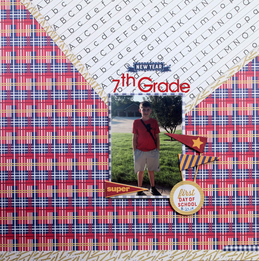
7. First Day of School
This scrapbook collection is fantastic for scrapping school photos whether your kiddo is little or is a teenager. To keep this layout looking a little older, Sam started the layout with her focus on the red plaid paper. Nothing says sophisticated quite like a good plaid.
Then, choosing from the fun kit upgrades, she settled on a few flags that looked a little more collegiate. Plus, they go really well with her son’s outfit for the day. Sam also added a few phrase stickers from the base kit to highlight the new school year. To finish her page, she mixed the plaid paper with the alphabet lined/pencil one and brightened up the entire layout!
Check out more of Sam’s lovely layouts on her blog!
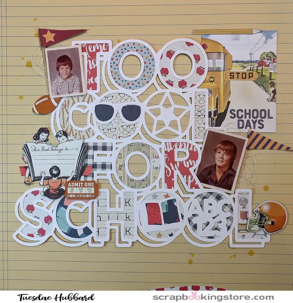
8. Too Cool for School by Tuesdae Hubbard
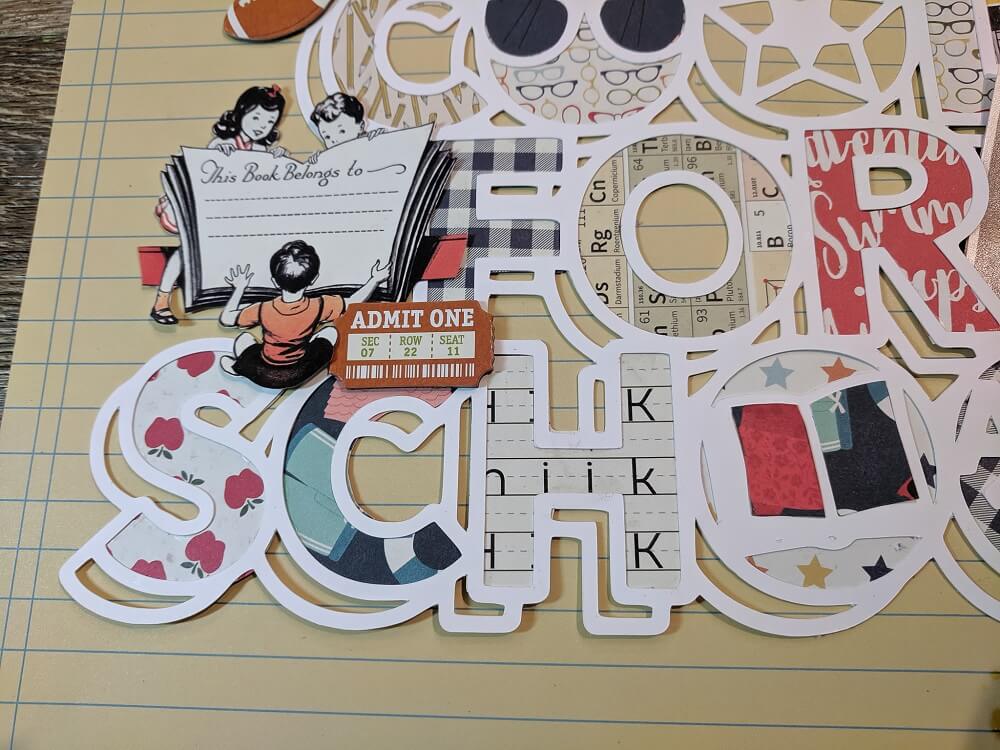
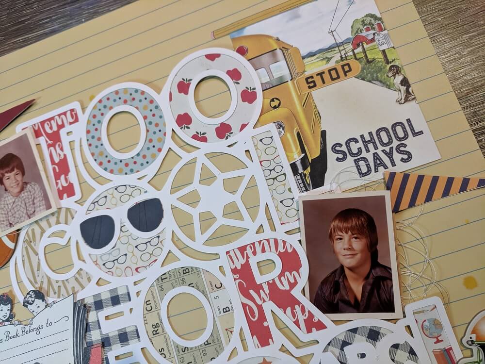
Tuesdae loves the vintage vibe of this scrapbook collection. She chose a cut file from Cut Shoppe to use as many of these fun papers as possible. She wanted to pull in a couple of leftover papers from the August kit as well since the red went so well with the school theme. The photos are of her brother who passed away 4 years ago, back when he was in elementary and middle school. She loves preserving his memory and these papers and embellishments worked perfectly to that end.
Next, she traced around the letters and cut out the papers to fill in. Then, she took the 3×4 cut apart and fussy cut out the school book image and pencil, plus the 3×4 card with the school bus. She enjoyed fussy cutting to add to the sticker collection and other embellishments. Her brother played football for years so the BoBunny chipboard in the collection was the perfect add on. A scrap of the papers finished off the border and added balance.
Tuesdae loves the options available in the scrapbook collection. There are so many ideas she has for masculine pages, fall pages, family heritage layouts, sports layouts, comparison of then and now layouts for her girls, not just school theme. It is so versatile if you think outside the box! We are SO excited to see more of Tuesdae’s creation for this month using the September kit.
Watch more of Tuesdae’s fantastic tutorials on her Youtube channel!
9. School Layout by Terra Merriweather
Terra used the ruler from one of the pages to anchor her photo. She matted it onto solid card stock and then placed the photo onto a large rectangle. Then, she used the ‘notes home’ block from the kit for journalling. She cut a couple of more strips from different patterned papers and placed them at the bottom of the page.
Lastly, on the top of the page, Terra placed a couple of apples she machine cut using her Silhouette Cameo, along with the piece of notebook paper with the word school cut out.
To see more of Terra’s fantastic layouts, check out her Instagram!
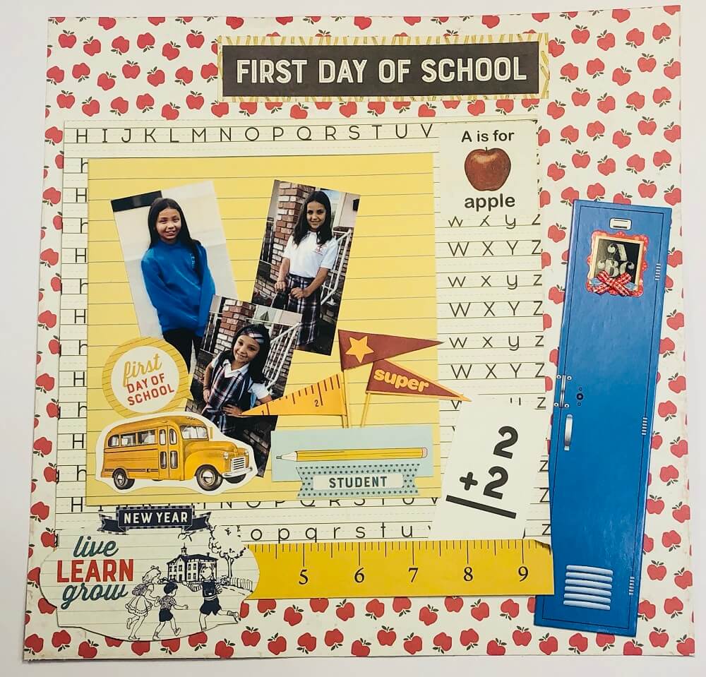
10. Back to School by Rosa Kelly
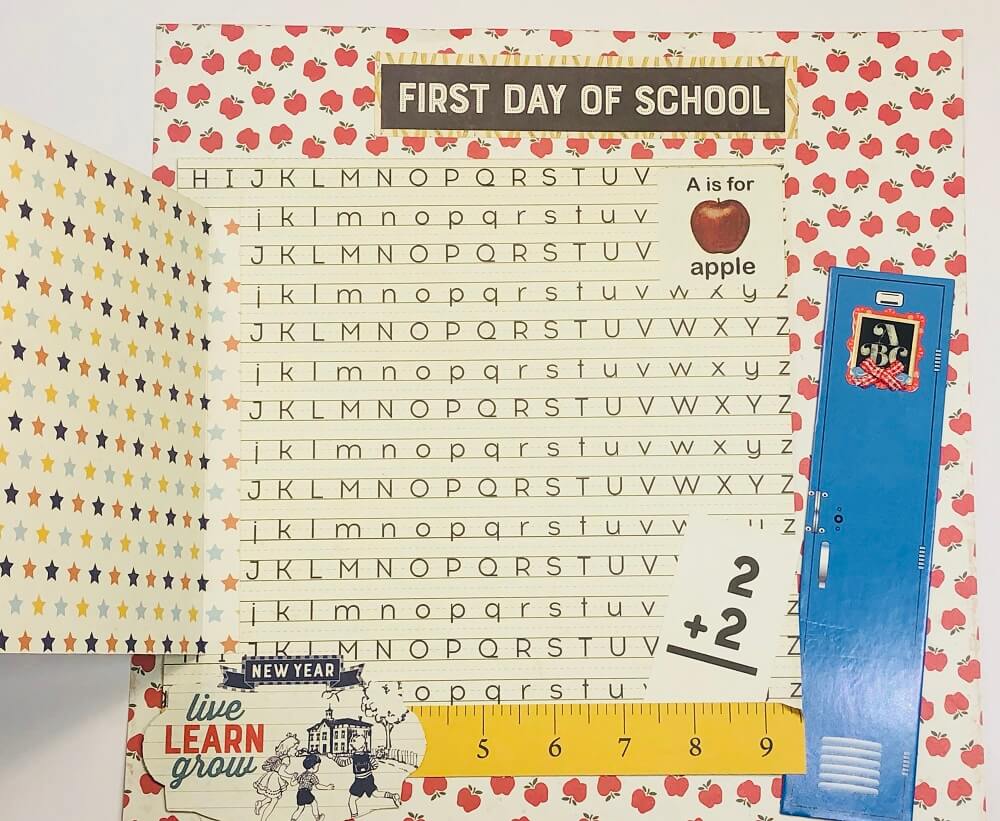
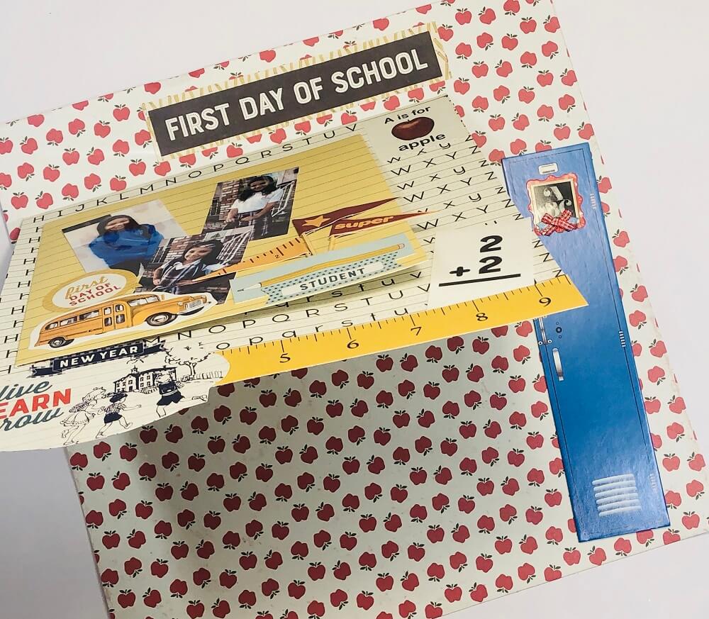
This month’s kit was perfect for the beginning of a new school year! To make this interactive layout, Rosa started with a sheet of 12×12 page from the September scrapbook collection. She cut a sheet of paper at 9” x 9 ½”. Score it at ½” along the 9 ½” side and added it at the top left side of the layout by gluing only the ½” flap (about 2” from the top). Then, she cut another design sheet at 7” x 7 ½”. Scored it ½” along 7 ½” and added it to the left side of the 9”x 9” layout.
Rosa added the “First Day of School” cut out to as a title to her page. She used the locker chipboard on the right side of the layout and the toothpick flags to embellish the front.
Then, she used a sticker from the sticker sheet (backed on cardstock) and attached it to the bottom of the 9×9 layout. Finally, she used different stickers from the collection to dress up the page.
Watch how Rosa made this awesome interactive layout below!
September is a month filled with excitement, pride, agitation and the chance to make wonderful new memories. As we leave the less structured days of summer behind, we’re transitioning into new routines. Don’t miss out on the chance to capture all the beautiful fall moments.
New to scrapbooking? No problem! The Scrapbooking Store is always here to inspire you and allow your creativity to flow. Visit our blog here to see more amazing layouts that our Design Team compiled to spark new ideas and get you started on your projects. There’s quite a scrapbook collection waiting for you!
Join us now and get monthly kits delivered right at your doorstep. Click below
GET OUR MONTHLY KITS DELIVERED TO YOUR DOOR!