7 Scrapbook Travel Layout Ideas
Summer’s here and so is your opportunity to make new memories. Whether you’re traveling, spending time with your family and friends or just basking in the sun, we have something in store for you. The Scrapbooking Store's June 2019 Kit is the "Quest" collection by Authentique and it’s perfect for keeping a travel diary or for starting a new collection!
There’s always something nostalgic and beautiful about preserving our memories with care. So make sure that you document every trip by taking pictures, keeping the tickets and even getting postcards to later add to your travel project. Get inspired by the following travel layouts catered for you by our Design Team:
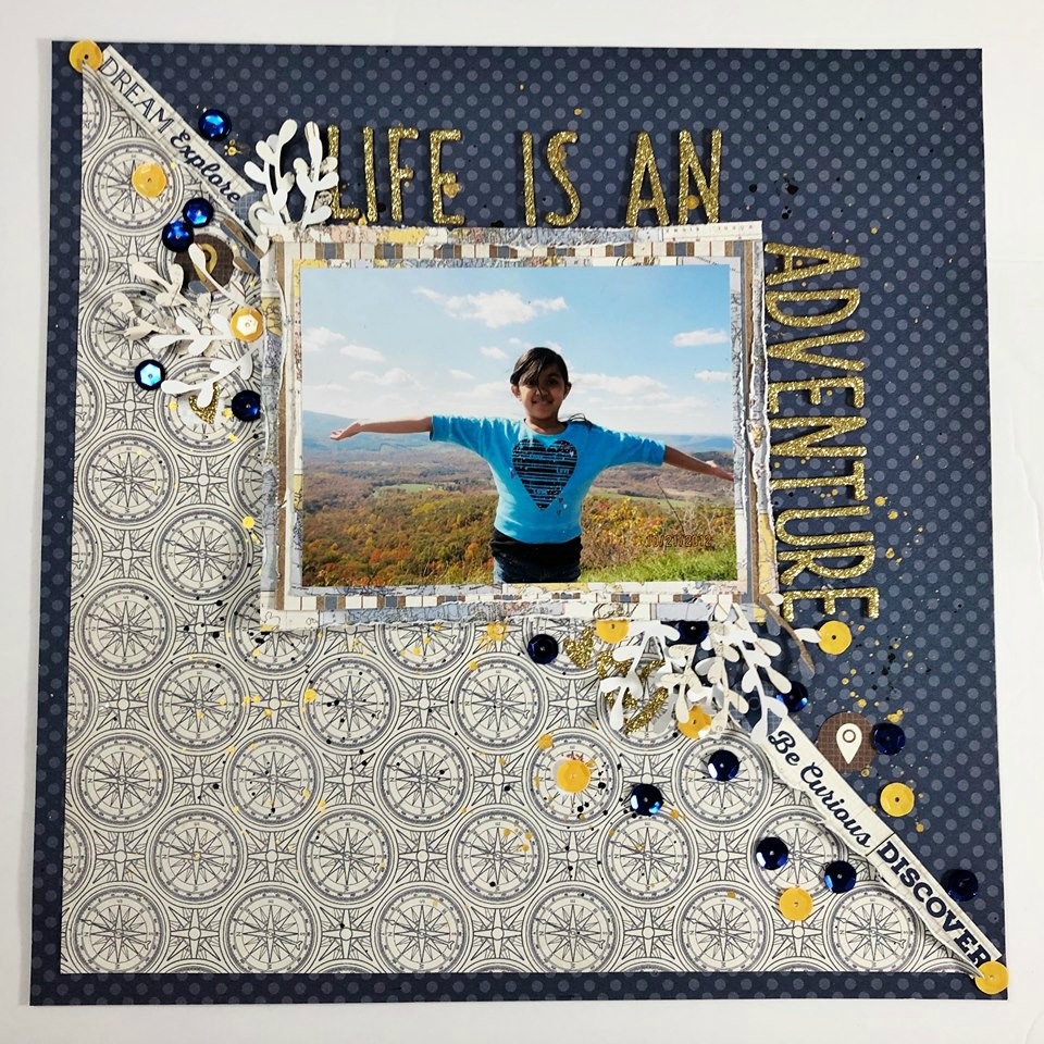
1. Life is an Adventure by Becky Bacchus
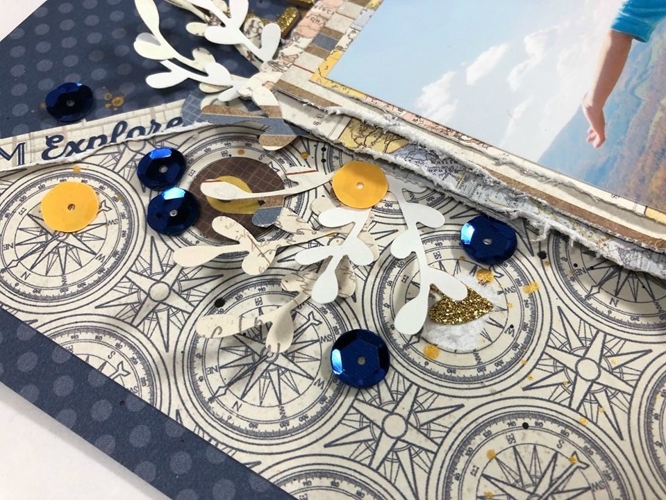
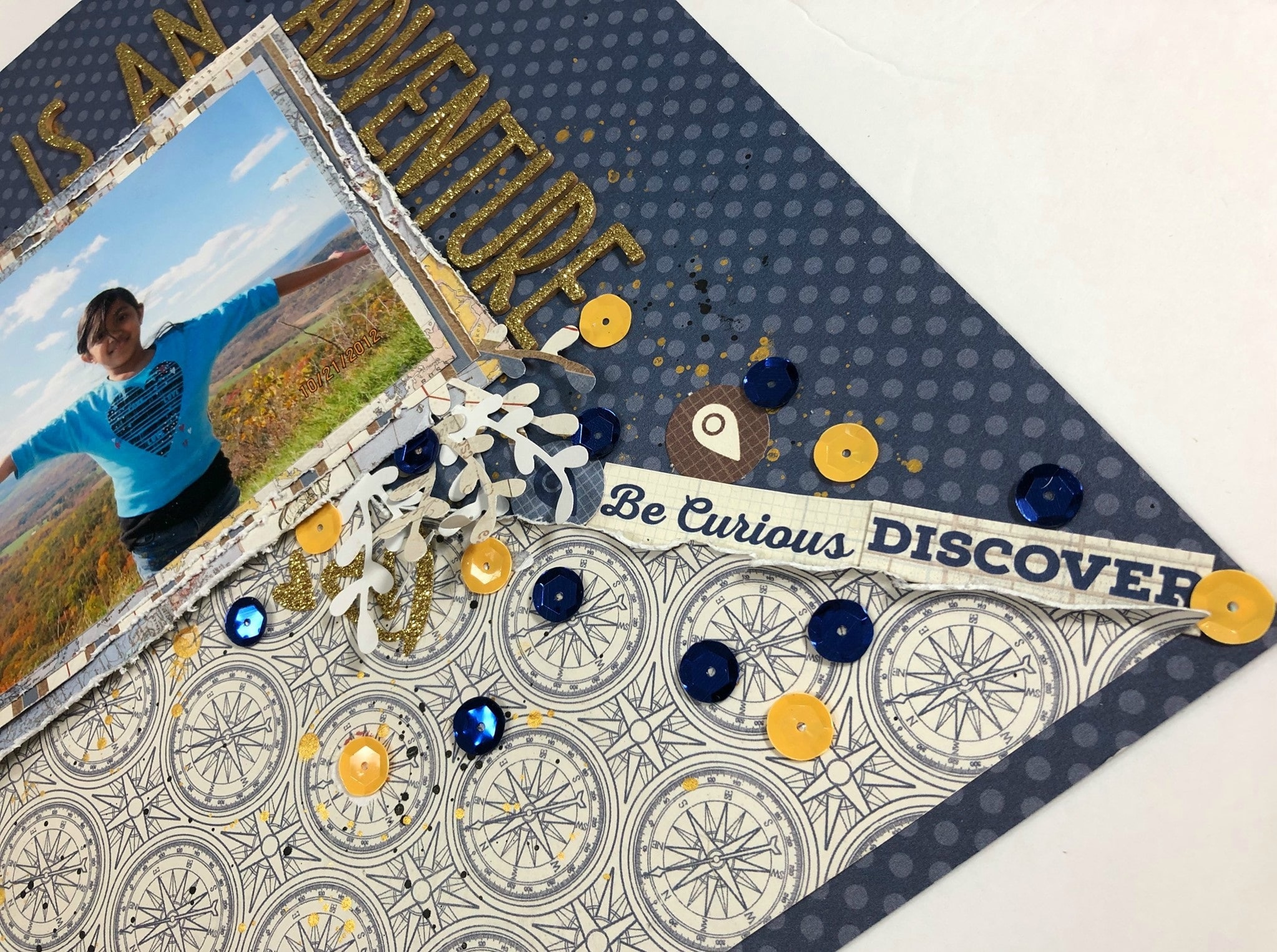
Becky used our June kit to send a beautiful message to her daughter. She began by distressing the longer side of the patterned paper she cut into a triangle before gluing it to her background. She then added some gold and black splatters to it.
After matting her photo on 3 layers of patterned paper, she distressed each edge and then added it to her background with some foam behind to gently rise it and add some dimension to her layout. She used alpha thicker from her stash to add her title that reads "Life is an Adventure."
To finish it off, Becky added some word phrases and geo tags from the die cut sheets, some leaves she punched out using patterned paper and cardstock along with some of the beautiful sequins that came with our June kit. To see how this layout came together you can watch the full process below. Don't forget to check her Instagram page to see more gorgeous layouts!
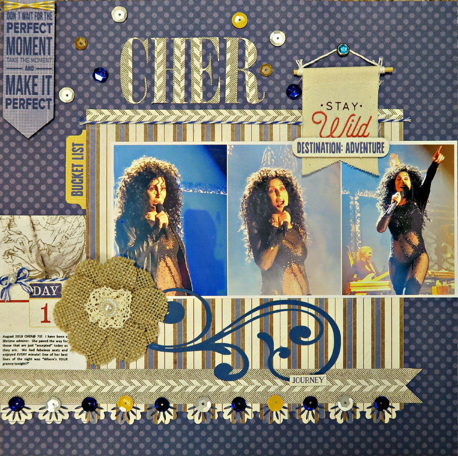
2. "CHER" Layout by Marci Bensing
Marci took these photos of Cher from the 4th row in Atlantic City last summer - it was a huge thrill! She chose the Authentique dotted BG sheet to make the blue in the photos standout. She then cut the striped paper to go under the photos and used a border punch at the bottom of that sheet. She also cut 2 strips from the "Quest Three" sheet; the first she made into a banner and placed it above the punched edge then she finished the edge area with Studio Calico's sequins from the kit’s upgrades. For the 2nd strip, Marci placed the striped paper above and joined it with a piece of twine since there’s rarely a layout she does without one!
For the left side of the photo Marci used a small piece from the back of "Quest Three” and below it she used a cut from “Quest Eight”, the DAY 1 journaling piece, then added typed journaling. Lastly, she used her Silhouette Cameo still using "Quest Three” to cut the title "CHER". To complete the embellishing she scattered more sequins around the title. From "Quest Elements" she chose to use: “make it perfect” (attaching a little twine to it!), “journey”, “bucket list”, and “Destination: Adventure” and popped up all except for the “bucket list” one.
Before popping up "Destination: Adventure", she used the upgraded Pink Paislee adorable “Stay Wild” tag by placing it over the page with a brad. To finish the page off she added one of the upgraded American Crafts beautiful textured flowers and used her Silhouette Cameo to die cut a flourish attached to the flower. The theme of this kit collection is travel and YES, we did travel to see this show.
So do you see now how versatile this collection can be?! Check out her blog to see more wonderful layouts like the one above!
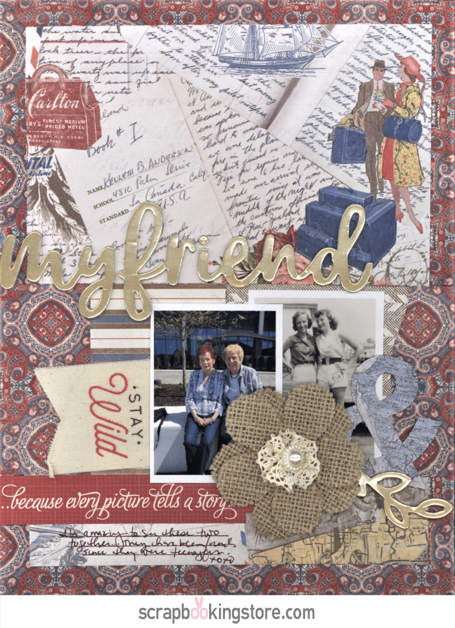
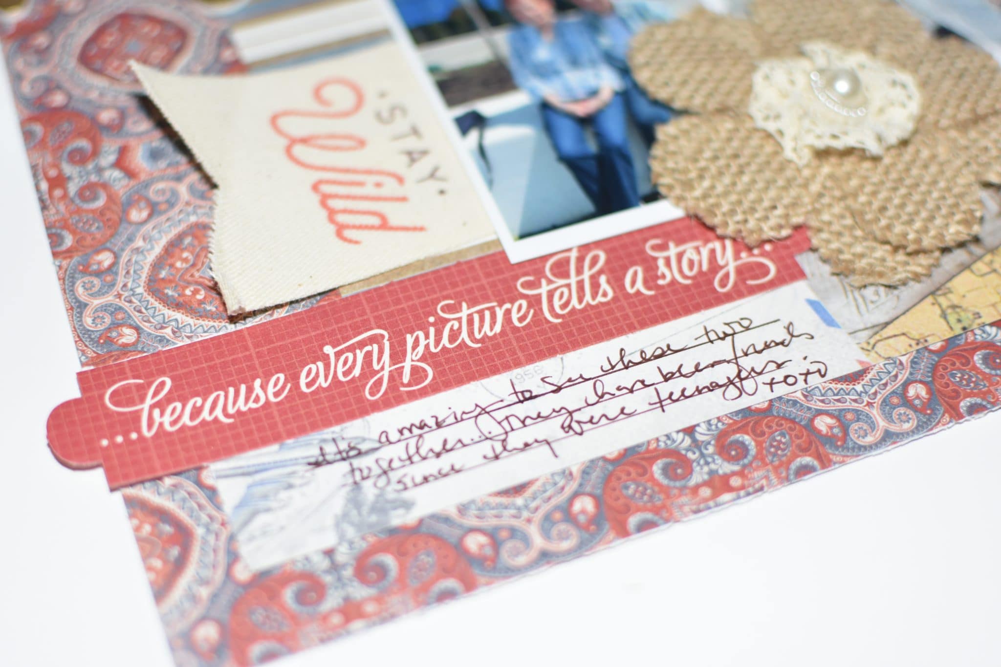
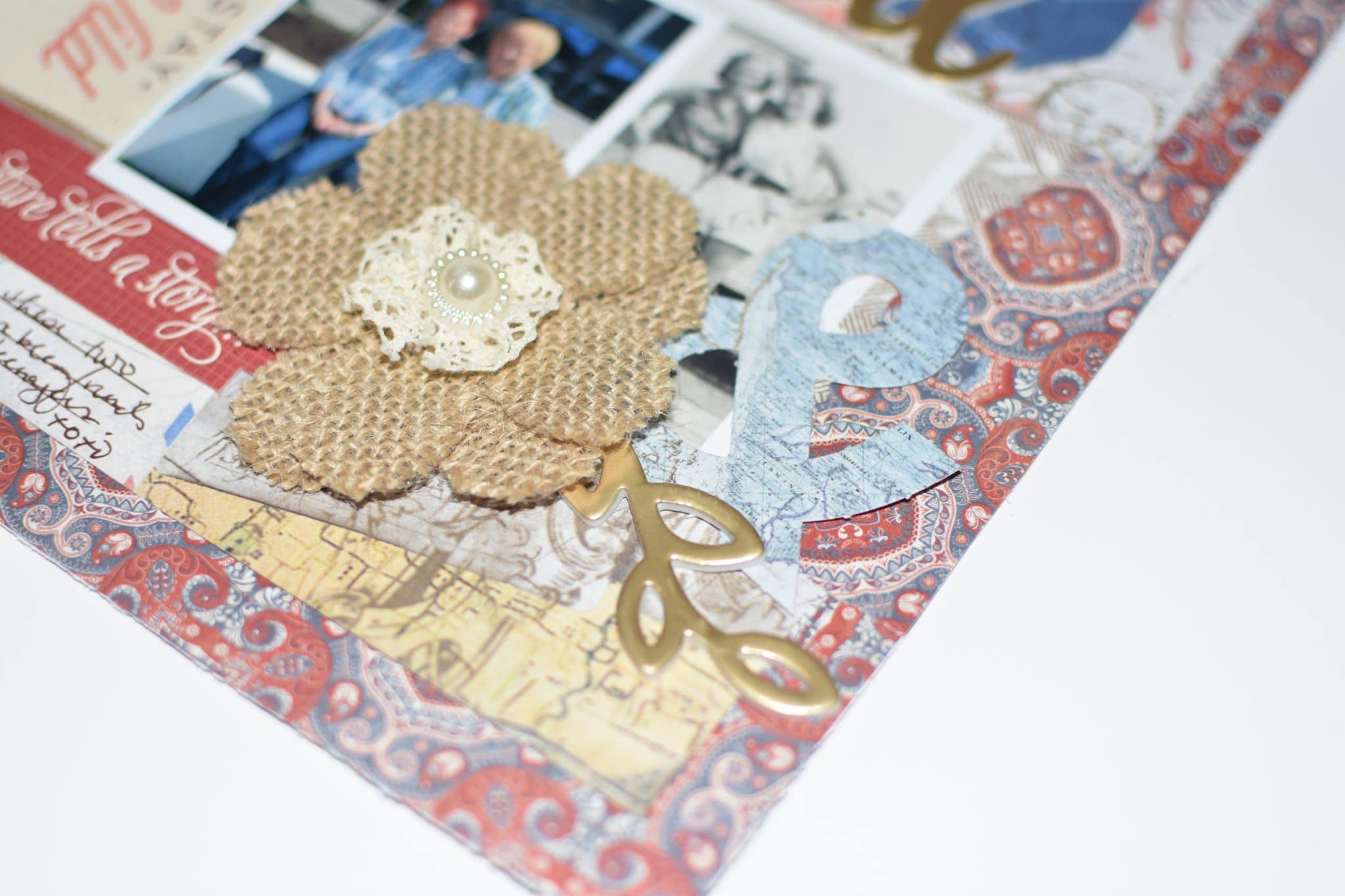
3. My Friend by Nicole Martel
Nicole cut the red and blue 12”x 12” patterned paper to measure 8 ½”x 11”. Then she cut the postcard patterned print to measure 7 ½”x 10 ½”. She centered the postcard paper on top of the red and blue one. Using scraps from the red and blue patterned paper, she also cut the scrap to measure 8 ½”x3 ½”.
She glued a strip to the center of the layout, horizontally, approximately 2 ¼” from the bottom of the layout. She also used the remaining scraps, cut the two patterns to measure 3 ½”x2 ½” and mounted them to the center of the strip, tearing the edge of the right mat.
She printed and cropped the two 3 ½”x 2 ½” photos and mounted them to the mats as shown. To complete the layout, Nicole used her favorite embellishments. She also used a ruler and pen to add journaling at the bottom left side of the layout.
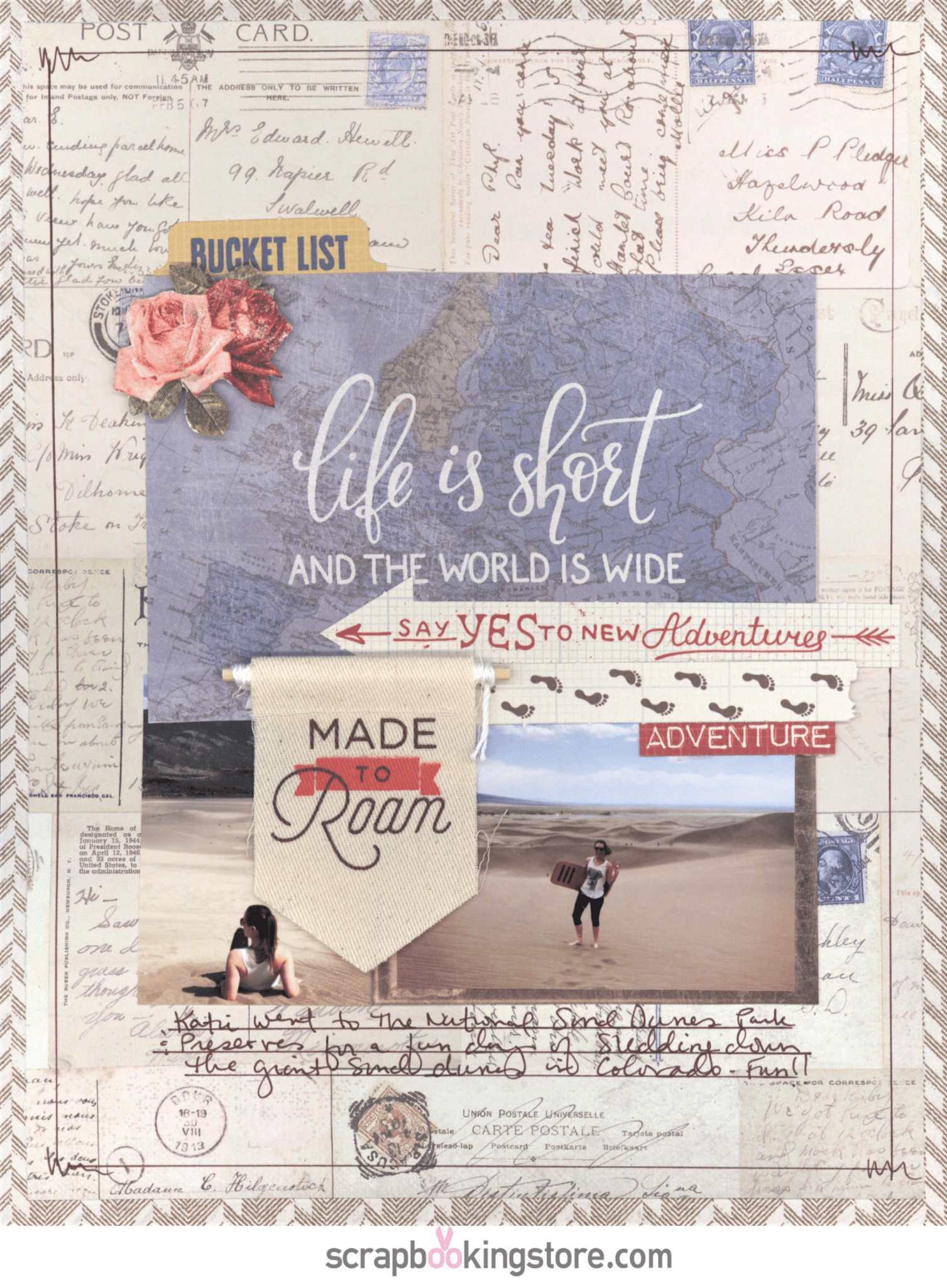
4. Made to Roam-Nicole Martel
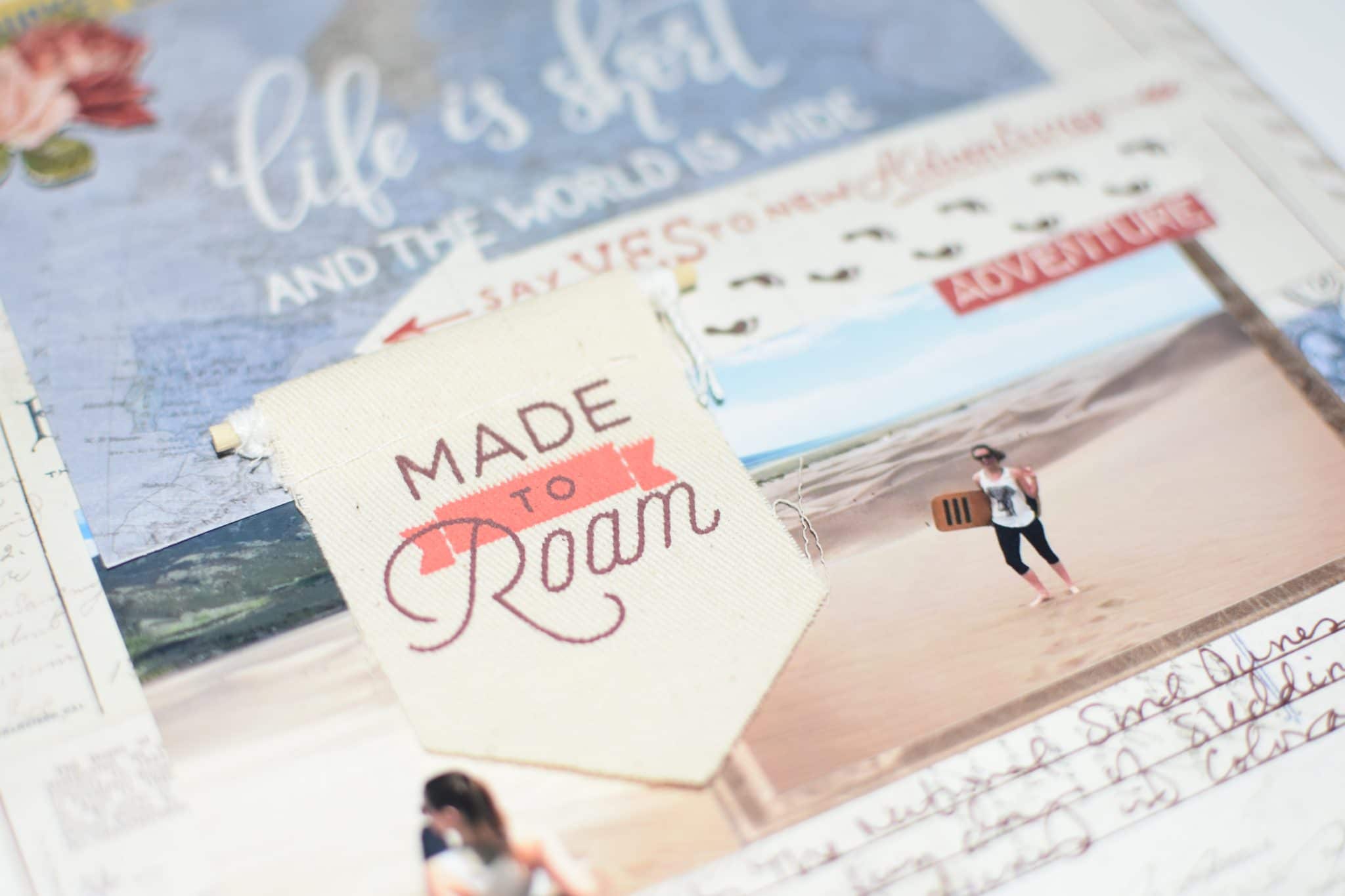
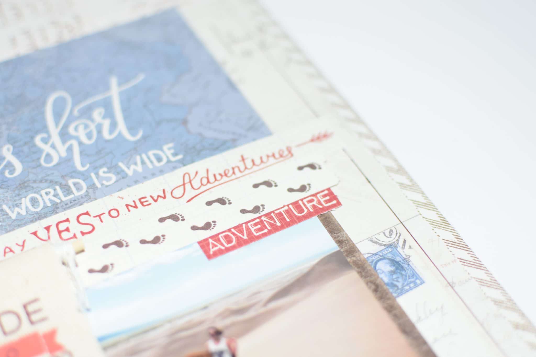
For Nicole's second layout, she cut the brown and white chevron patterned paper to measure 8 ½”x 11”. She then cut the postcard patterned print to measure 7 ½”x 10 ½”. She mounted the postcard paper to the center of the chevron paper. Added the 4”x6” “Life is short and the world is wide” journaling card from the cut-apart sheet and glued it the top of the layout, approximately, 2 ½” from the top.
She cut the gold frame from the cut-apart sheet and cropped the photo to fit inside the frame. Then she glued the frame below the 4”x6” journaling mat and added another photo to the left side of the mat. She also punched out the die cuts from the sheets and glued them to the layout as you can see from her awesome pictures.
Using glue dots, Nicole mounted the “Made to Roam” canvas banner between the two photos. Then turned to a ruler and brown pen to journal. The ruler was then used to draw a ¼” border around the layout. Gorgeous layout. right?! Visit her blog to see more!
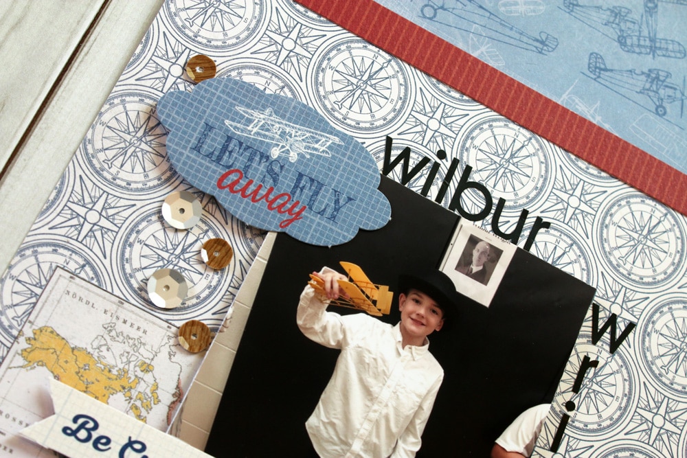
5. Flight: Adventure Awaits Layout by Sam Taylor
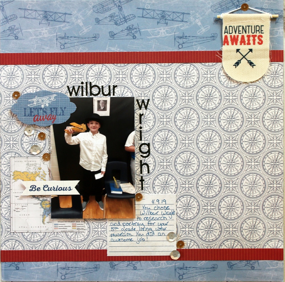
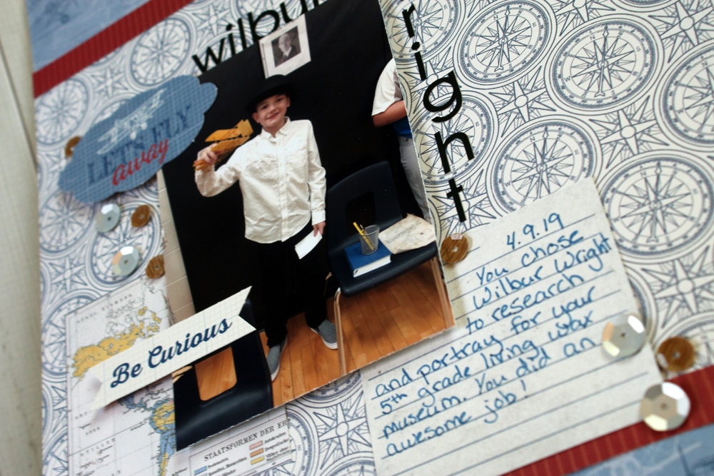
Sometimes a kit just has the perfect paper for a photo you never thought you'd find the perfect paper for. This month's kit presented such an opportunity to Sam. Her son did a report on Wilbur Wright for his class' Living Wax Museum and she wanted to cherish this memory.
The vintage travel theme of this kit was amazing for Sam's photo of him being Wilbur. She used embellishments and accent papers that had a bit more cream to them than the darker blues and burgundies.
Since his photo was rather dark and the blue vintage plane patterned paper was also on the darker side, she lightened up the entire layout up with softer colored accents. Visit Sam's blog to see more of her amazing layouts!
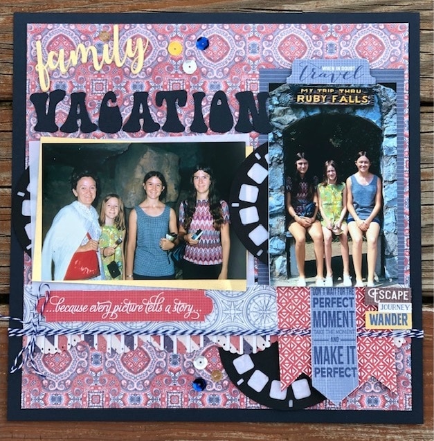
6. Family Vacation Layout by Melissa Bierlein
Melissa started with a dark blue cardstock and layered the patterned paper from the kit on top of it. The patterned paper was cut down 3/4” on two sides and then centered on the cardstock. The title was cut with her Cricut. ‘VACATION’ is written in aHippie Movement font that she found online and downloaded for free. She then cut out the words “family” and “vacation” THREE times and layered them on top of each other to add dimension.
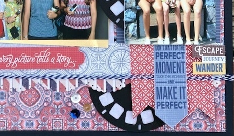
One photo was matted on gold and vellum and the second one was matted on the denim stripe from her new kit. She used two different border punches for the strips underneath the photos; both of the papers she used are from the June 2019 kit.
She cut out the REEL image to complete the 1970’s layout. She then placed it behind the pictures die cut banners. The words she used all across her layout are from the die cut sheet in the kit. She then finished the layout with some additional die cuts, twine over the border strips and scattered some sequins!! Get to see more of Melissa's stunning layouts on her Facebook page!
7. Explore Layout by Terra Merriweather
The inspiration for this page is a picture Terra took of her twins (then around the cute age of 4). For this layout she used the map side of the "Quest Two" paper. Then she cut a 3" strip from the "Quest Seven" paper and placed it 2" from the right side.
As for the word "Explore" by Megan Hardy Designs (3"H x 10.5"W) she cut it using her Silhouette Cameo and placed it 1" from the bottom of the page. She also used a Silhouette cut file for the "Life is a journey" phrase by Lori Whitlock (~ 3"H x 5.5"W) and placed it about 1/2" below the top right side. She finished the layout by adding four of the "Quest" elements punch out phrases. Get to see more of Terra's crafts and layouts on her Instagram!
New to scrapbooking? No problem! The Scrapbooking Store is always here to inspire you and allow your creativity to flow. Visit our blog here to see more amazing layouts that our Design Team compiled to spark new ideas and get you started on your own projects. There’s quite a collection waiting for you!
Join us now and get monthly kits delivered right at your doorstep. Click below
